26
1
submitted 11 months ago by koavf@lemmy.ml to c/typography@lemmy.ml
27
1
submitted 1 year ago by koavf@lemmy.ml to c/typography@lemmy.ml
28
1
MaxiBestOf (maxibestof.one)
submitted 1 year ago* (last edited 1 year ago) by koavf@lemmy.ml to c/typography@lemmy.ml

You can view sites by font

29
1

I've released a new typeface/font called Jack of Gears.

https://michaelwmoss.com/typefaces/jack-of-gears

30
1
submitted 1 year ago by soyagi@yiffit.net to c/typography@lemmy.ml

cross-posted from: https://open-source.social/m/technology@beehaw.org/t/15036

I've built a new font! Thoughts and feedback on my approach very welcome.

31
1
submitted 1 year ago by soyagi@yiffit.net to c/typography@lemmy.ml
32
1
submitted 1 year ago by mogoh@lemmy.ml to c/typography@lemmy.ml
33
1
submitted 2 years ago by koavf@lemmy.ml to c/typography@lemmy.ml
34
1
submitted 2 years ago by greensand@lemmy.ml to c/typography@lemmy.ml
35
1
submitted 2 years ago by greensand@lemmy.ml to c/typography@lemmy.ml
36
1
submitted 2 years ago by baruchel@lemmy.ml to c/typography@lemmy.ml
37
1
submitted 2 years ago by kixiQu@lemmy.ml to c/typography@lemmy.ml

He's an independent type designer. His site shows properly fleshed out respectable-looking typefaces for respectable-typography costs, but the Font Of The Month Club is the real joy. Whether you're looking for Victorian flavor, elegant text typefaces, design-forward display options, or the latest font feature noodling around (color fonts! color fonts!) there's a fine assortment here to be worth looking through. The Mini license costs are really nice as a reasonable impulse buy for the font-oriented and not too shocking a figure for the non-font-oriented.

I'm not at all a proper Font User -- my website's main typeface is a true abomination I keep only because an SVG filter to replicate the effect sounds hard to get right -- but I love imagining print projects that would merit Polliwog or Klooster Thin.

38
1
submitted 2 years ago by Fakefunk@lemmy.ml to c/typography@lemmy.ml
39
1
submitted 3 years ago by helix@lemmy.ml to c/typography@lemmy.ml
40
1
submitted 3 years ago by koavf@lemmy.ml to c/typography@lemmy.ml

How did Choc, a quirky calligraphic typeface drawn by a French graphic designer in the 1950s, end up on storefronts everywhere?

41
1
submitted 3 years ago by koavf@lemmy.ml to c/typography@lemmy.ml
42
1
submitted 3 years ago by koavf@lemmy.ml to c/typography@lemmy.ml
43
1
submitted 3 years ago by koavf@lemmy.ml to c/typography@lemmy.ml

Atkinson Hyperlegible font is named after Braille Institute founder, J. Robert Atkinson. What makes it different from traditional typography design is that it focuses on letterform distinction to increase character recognition, ultimately improving readability. We are making it free for anyone to use, download here!

44
1
submitted 3 years ago by koavf@lemmy.ml to c/typography@lemmy.ml
45
1
submitted 3 years ago by koavf@lemmy.ml to c/typography@lemmy.ml
46
1
submitted 4 years ago by koavf@lemmy.ml to c/typography@lemmy.ml

How we came to represent (through inky marks) the vagaries of the mind, inflections of the voice, and intensity of feeling

47
1
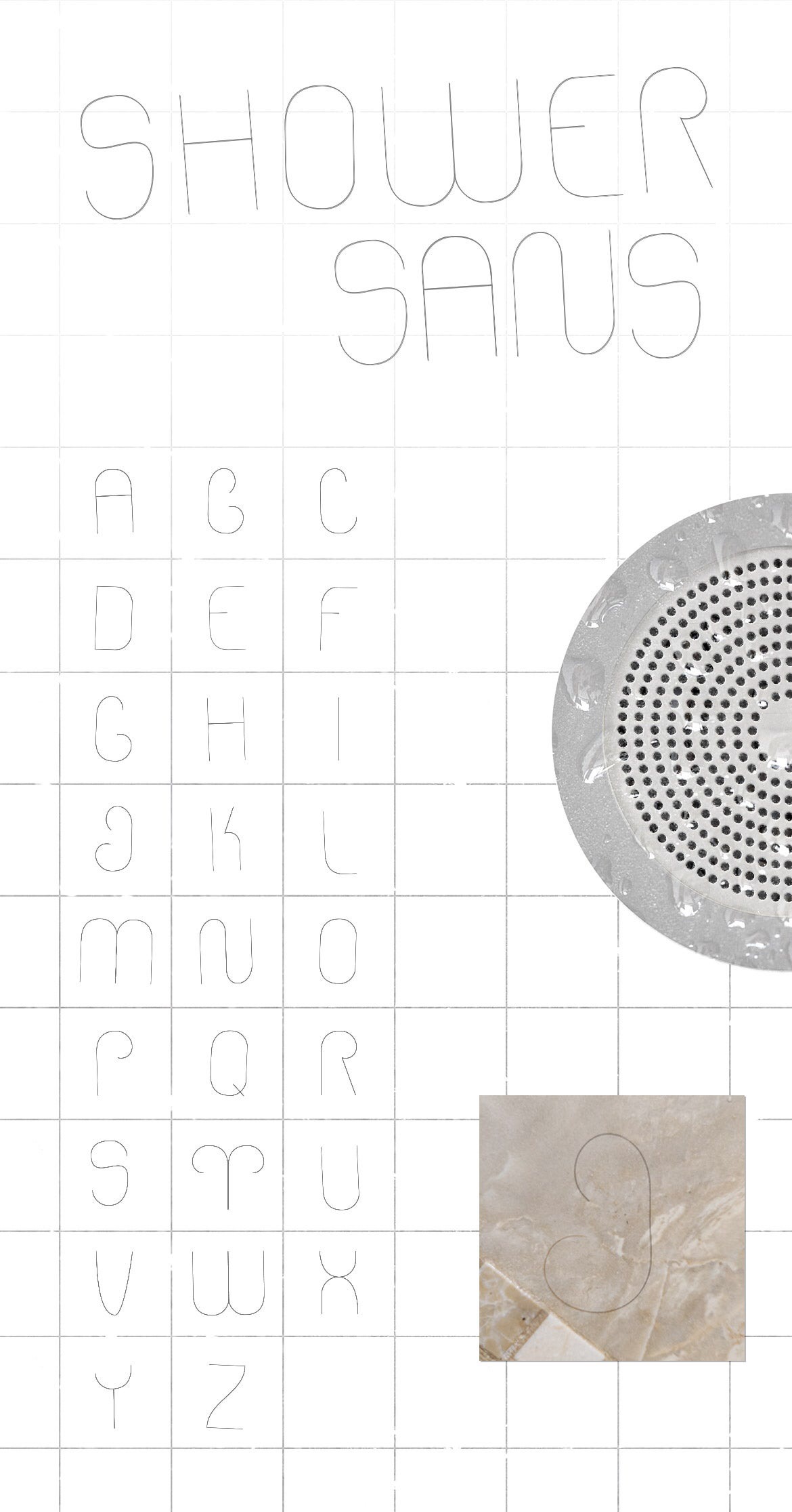
Shower font :) (lemmy.ml)
submitted 4 years ago by k_o_t@lemmy.ml to c/typography@lemmy.ml
48
1
submitted 4 years ago by koavf@lemmy.ml to c/typography@lemmy.ml
49
1
submitted 4 years ago by koavf@lemmy.ml to c/typography@lemmy.ml
50
1
Browser font rendering inconsistencies (blog.stephaniestimac.com)
submitted 4 years ago by koavf@lemmy.ml to c/typography@lemmy.ml

I was working on a project that required me pulling up the developer tools in different browsers against my personal website when I opened up Safari and noticed how drastically different the title of my page was rendering. It was extremely bold in Safari compared to the other browsers.

Much more bold than I expected it to be…

https://archive.is/wip/FsUTm

view more: ‹ prev next ›

Typography

180 readers
1 users here now

Type design, setting, fonts, etc.

founded 4 years ago
MODERATORS