this post was submitted on 13 Jul 2023
60 points (84.1% liked)
Memmy - An iOS client for Lemmy
6018 readers
1 users here now
founded 2 years ago
MODERATORS
you are viewing a single comment's thread
view the rest of the comments
view the rest of the comments


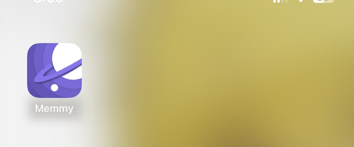
While the previous icon wasn’t the best, it had more character imo. This one feels generic and looks too much like the Samsung internet icon.
Ahh now that you mentioned it, now I know why it feels like it doesn’t stand out much. It feels too much like a browser icon. Thanks. This has been nagging at me since I first saw it.