this post was submitted on 04 Aug 2023
21 points (100.0% liked)
Crappy Design
596 readers
1 users here now
Poor designs resulting from incompetence. This covers unintentional artifacts. (Intentionally malicious/anomalious designs belong in c/assholedesign)
founded 5 years ago
MODERATORS
you are viewing a single comment's thread
view the rest of the comments
view the rest of the comments

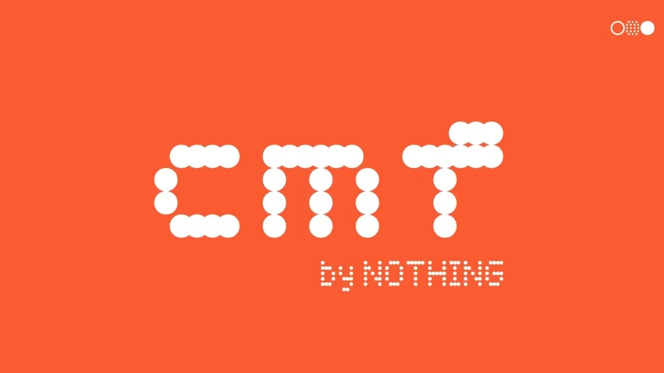
The sad thing is, they had enough vertical "pixels" to make a proper "F". 🤦♂️ If they were worried it didn't look lowercase enough, just remove the top-left "pixel".
Of course what they really need is for someone to shake them and yell "IT'S 2023, ENOUGH WITH THE FAKE DOT-MATRIX DISPLAY BULLSHIT", but what can you do.