this post was submitted on 30 Jun 2023
9 points (100.0% liked)
Community Meta Discussion
736 readers
1 users here now
founded 2 years ago
MODERATORS
you are viewing a single comment's thread
view the rest of the comments
view the rest of the comments
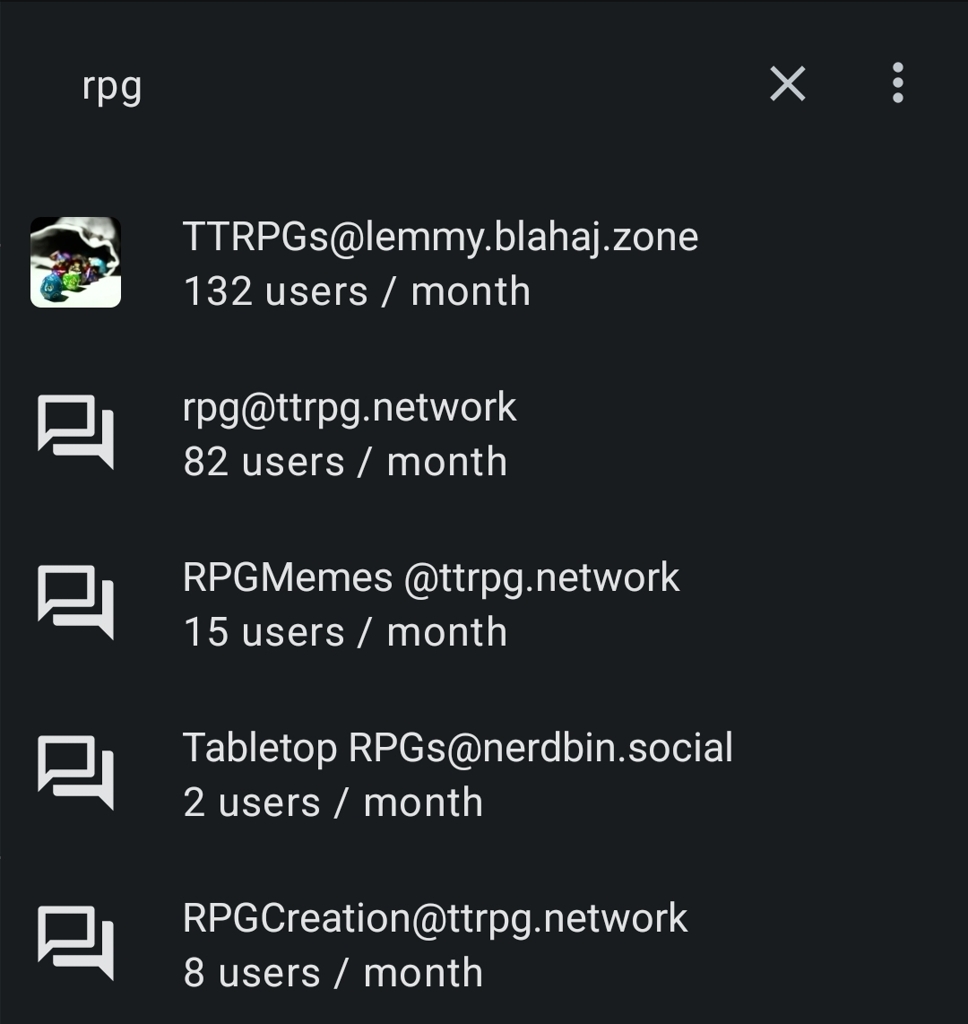
I see them in wefwef and Jerboa.
Here's what they look like for me on Jerboa: