83
you are viewing a single comment's thread
view the rest of the comments
view the rest of the comments
this post was submitted on 02 Mar 2024
83 points (100.0% liked)
tails: A Place for Mastodon Posts
344 readers
1 users here now
A virtual community
Posts from Mastodon users, featured natively in a community, so you can view them without the need for them to be re-hosted or screenshoted, and reply to the original author and Mastodon respondents if you wish.
Has so far included content from Warsandpeas, Mr. Lovenstein, SMBC, Loading Artist, Low Quality Facts, nixCraft, ElleGray, and other interesting or provocative stuff I've random'd across on Mastodon.
Supported:
Comments & Upvotes
Unsupported:
Posts, Downvotes, & PD's Automod
founded 10 months ago
MODERATORS

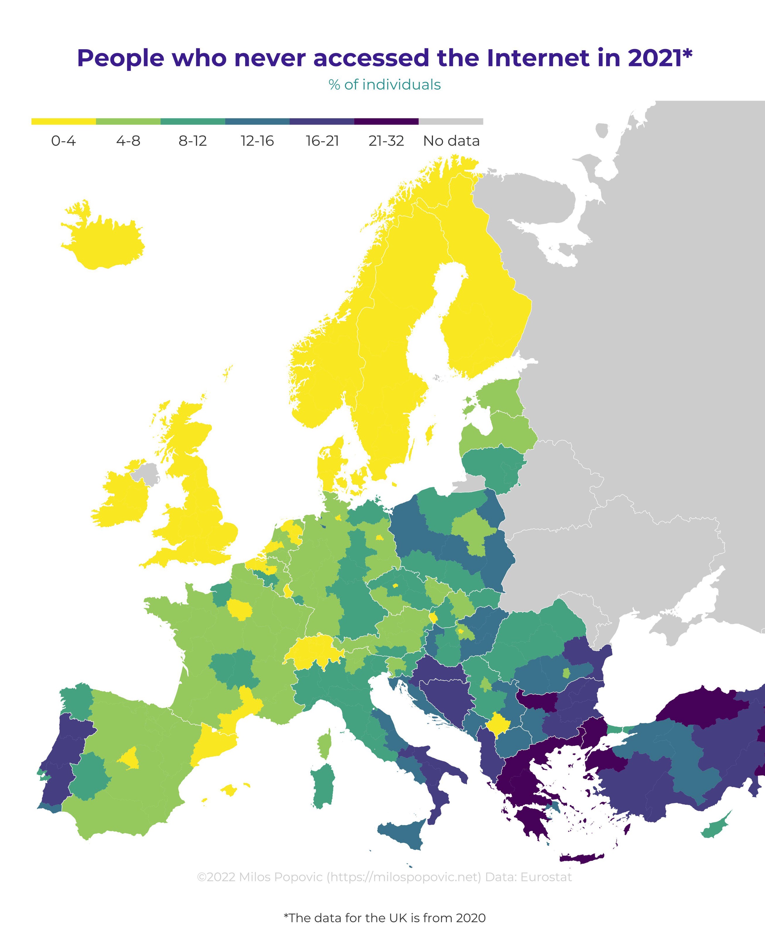
Cool, another way to map out the poverty distribution
Yes/no/maybe
Like most things, it’s difficult to shake it all out to one variable.
An obvious example being Italy, whos demographics skew very old. Poverty or not, you’ll find many 90 year olds who’ve never used the internet (and if they did, they maybe didn’t even realize that it was)
That’s a fair point, but it maps pretty cleanly. Please note that this is the most recent map I could find
Actually, no, I don’t think it shows that. A few examples: Your map shows that in Serbia, Kosovo and Romania there’s some of the most people at risk of poverty, but most of their regions have higher internet adoption rates than the surrounding regions. It shows southern Spain to be much worse of than Portugal, but in the internet map Portugal had much lower internet adoption. West-Poland is apparently richer than east-Poland, but one of those richer western provinces had some of the lowest internet adoption rates in Poland.
I think you’re missing the forest for the trees. An entire country at a fairly high risk for poverty is very different from one high risk region and one low risk region of a country, in regards to the distribution of internet access. Additionally these maps are measuring different things, not everything is going to line up perfectly. You have to look at the overall trend, which shows a general tendency for Internet access to be linked to wealth.
I’m not trying to read something that isn’t there. Poverty does cause negative consequences and it will show in statistics, but here at least, poverty does not seem to be the dominant factor.
The internet adoption map mostly shows 3 correlations:
But the one that clearly dominates is 1) Government policy. You can have 2 regions with similar demographics + wealth and a national border between the 2 regions, and the internet adoption rate between the 2 can be vastly different, a far bigger difference than between 2 regions within the same country.
Your attempt at discrediting my obversations as looking at trees in a forest is cute, but it’s not going to fly. You can’t claim that a forest is boreal and then if someone observes that it contains palm trees, proclaim that they’re not allowed to look at the trees.
Agree to disagree then. I’m not interested in arguing with someone who chooses to take offense over a metaphor.
Again you resort to a personal attack instead of trying to argue with facts. Cute.
Bayern is also a good example counter example against the poverty argument. Very wealthy region, but in 2021 they apparently had lower internet adoption than most other west-german regions. Saarland could be seen as an example of the poverty argument, but also of the age argument: it’s young people that move away.
Galicia in Spain is also wealthier than average in Spain iirc, but the map also shows them as having lower internet adoption than the rest of Spain.
Also the heat distribution? People in hotter countries actually go outside?
Wouldn’t it be hotter out of the shade? This makes no sense.
Well, I was joking, but if we’re going to analyse it: up here in the cold parts, people avoid going outside much until summer comes around, because it’s cold and wet. We stay inside with our warmth, computers and TVs. In the warm parts, people enjoy the outdoors and the beach year round.
And that, children, is why Linux is from Finland instead of Greece.