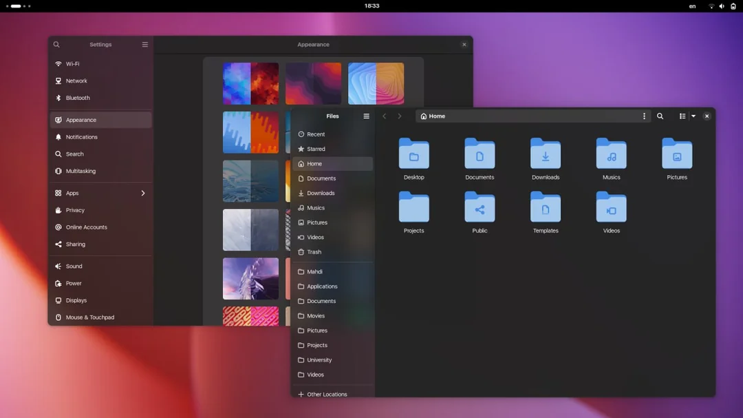
Isn't it more like Vista style?
We could ask the author of blur my shell if he could implement this too
I WANTED THIS FOR SUCH A LONG TIME THANK YOU FOR SHARING!!
In case you would want this, how would you use the css you provided? Not too familiar with theming gnome.
Read the first line of the CSS provided, it tells you where to put it!
Thank you, really cool!
Looks awesome! How to install that?
I haven't tried it myself yet, but all you need is here: https://gist.github.com/taiwbi/0c33fa7afaa65d2a593e2f77fb3d4af6
I figured that out... But where do I put it?
Does the instruction on the first line of the file not work?
Now I feel stupid...
Happens to the best of us :)
The WhiteSur theme does that for Nautilus and no other apps, it's pretty weird.
Gnome
The GNOME Project is a free and open source desktop and computing platform for open platforms like Linux that strives to be an easy and elegant way to use your computer. GNOME software is developed openly and ethically by both individual contributors and corporate partners, and is distributed under the GNU General Public License.
