if the majority don't like the change enough I'll revert it.
A client for the fediverse designed to be intuitive, fast, and sleek.
This community is a place to ask questions, report bugs, check on the latest updates, or share your experiences with Photon!
You can contact me at @Xylight@lemdro.id.
Rules
[solved] if it's been fixed.
if the majority don't like the change enough I'll revert it.
to be clear i think the new styling looks nice, i just like the shape of the old one.
also feel completely free to ignore my opinion
Since we're discussing rounding, how about dropdowns?
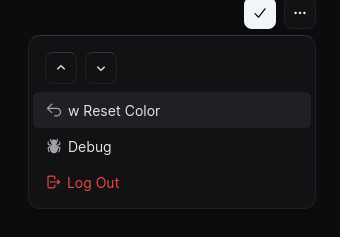
i like how they look now, i think making them look more round would be a downgrade, but thats just me
And, what if it had a glassy look by blurring what's behind?

Now we're going very modern.
I'm not sure, I might decrease transparency and try it with a bunch of different themes as some colors can make blurs look like ass.
i think that looks gr8! Matches the dock
I usually dislike this kind of roundness, but I'm not sure I hate it here. It does feel a bit inconsistent with the rest of the ui, though.