20
submitted 1 week ago* (last edited 1 week ago) by slopjockey@awful.systems to c/techtakes@awful.systems
top 20 comments
sorted by: hot top controversial new old
[-] Amoeba_Girl@awful.systems 10 points 5 days ago* (last edited 5 days ago)

jesus fucking christ

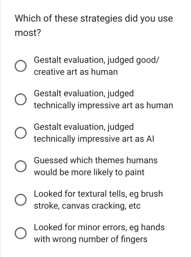
where's the option for "i know art and history and i can recognise actual paintings you fucking dummy" his little test would fail even harder if we were doing direct comparisons, like hey which one's a real painting (ignore the hand)

i don't know man, probably the one that doesn't look like a photorealistic anachronistic hodgepodge????? what the fuck even is that

[-] self@awful.systems 9 points 5 days ago

where the fuck is his left foot

also, did Scott fuck up and not notice this one is plagiarism? not just of the original painting, but however many art class portraiture recreations of the painting the model trained on

most likely including a particularly awful one I was behind the camera for! but because it’s art class and not assholes doing plagiarism, the point of the exercise isn’t that it’s original or even good (and under no circumstances are you pretending you came up with an original work) — it’s to explore the elements that made the original good. I remember we put a lot of effort into getting the light and shadow around the left shoulder and head just right, which are elements the generative knockoff just entirely fucks up because of course it does (also what the fuck is on his forehead?)

[-] Amoeba_Girl@awful.systems 4 points 5 days ago

yeah he didn't include the picture of a woman and child because you couldn't see the kid's thumb but this one is fine? he is so fucking weird. i can't tell how much of it is sheer stupidity and how much is pure spite because he really does seem to resent art and artists.

[-] Amoeba_Girl@awful.systems 9 points 5 days ago

Finally, I avoided most AI art in the DALL-E "house style", since everyone already knows this is AI - or in other similar styles that humans would have trouble replicating, maybe because they do too much with color and lighting, in a way that few human artists would have the talent or patience for.

lmaoooooo

the art appreciator has logged on

[-] slopjockey@awful.systems 6 points 5 days ago

I think the real picture is the one depicting the man with a mullet, a receding hairline, a black eye, a more blacked out eye, and a body slathered in baby oil.

[-] Soyweiser@awful.systems 16 points 1 week ago* (last edited 1 week ago)

"You hate AI art? Well name all real paintings!" the blog post.

Also talking about the urinal "Art, it seems, is most meaningful when it challenges our very concept of what art is." No that was in 1917. Pretty sure that nowadays 'what is art even?' art is quite overdone and boring.
[-] blakestacey@awful.systems 9 points 6 days ago

The idea that formalist experimentation and deliberately pushing the boundaries of a medium are only one of several goals to which art can strive is apparently too sophisticated for Scott Adderall. He also takes a leap from "influential" to "meaningful", an elision so hackish it's trite.

[-] swlabr@awful.systems 13 points 1 week ago

Ah, the highest form of art appreciation: badly designed surveys.

[-] slopjockey@awful.systems 10 points 1 week ago

Art's value is determined by two measurable factors: prettiness at a glance, and ungarbled signage, artist motivations be damned. With this in mind we can predict other advancements in entertainment (all art is entertainment!)

For example, future pro boxing matches will be performed by rock'em sock'em robots in skin suits. They can score more points than humans. Soccer will be performed by restaurant server robots...in skin suits. Humans will still have a place in Olympic skiing and swimming so long as human pleather warps in water.

I like how he even had someone with art expertise literally explain it to him and he writes it off as "lol she must have super artist vision for details."

I don't know there's something here about how broken the way we engage with art is. How commodified art is inherently decontextualized and while you can see the beauty or the power or whatever you lose something without the curation and presentation you get from a gallery or a museum.

I also want to dunk on a few of the specific inclusions. AI clearly doesn't understand the point of cubism in particular, making it an exceptionally clear example of what Scott's artist friend was talking about. Including a digital photograph of a collage that clearly makes use of the depth of the actual work is pretty dumb.

[-] Architeuthis@awful.systems 10 points 6 days ago* (last edited 6 days ago)

I like how he even had someone with art expertise literally explain it to him and he writes it off as “lol she must have super artist vision for details.”

I'll quote her since it's by far the only worthwhile part of the article:

When real pictures have details, the details have logic to them. I think of Ancient Gate being in the genre "superficially detailed, but all the details are bad and incoherent". The red and blue paint and blank stone feel like they're supposed to evoke worn-ness, but it's not clear what style this is supposed to be a worn-down version of. One gets the feeling that if all the paint were present it would look like a pile of shipping containers, if shipping containers were only made in two colors.

It has ornaments, sort of, but they don't look like anything, or even a worn-down version of anything. There are matchy disks in the left, center, and right, except they're different sizes, different colors, and have neither "detail which parses as anything" nor stark smoothness. It has stuff that's vaguely evocative of Egyptian paintings if you didn't look carefully at all. The left column has a sort of door with a massive top-of-doorway-thingy over it. Why? Who knows? The right column doesn't, and you'd expect it to. Instead, the right column has 2.5 arches embossed into it that just kind of halfheartedly trail off.

I'm not even sure how to describe the issues with the part a little above the door. It kind of sets a rhythm but then it gets distracted and breaks it. Are these semi-top protruding squares supposed to be red or blue? Ehh, whatever. Does the top border protrude the whole way? Ehh, mostly. Human artists have a secret technique, which is that if they don't know what all the details should be they get vague. And you can tell it's vague and you're not drawn to go "hmm, this looks interesting, oh wait it's terrible".

I think part of the problem with AI art is that it produces stuff non-artists think look good but which on close inspection looks terrible, and so it ends up turning search results that used to be good into sifting through terrible stuff. Imagine if everyone got the ability to create mostly nutritional adequate meals for like five cents, but they all were mediocre rehydrated powder with way too much sucralose or artificial grape flavor or such. And your friends start inviting you over to dinner parties way more often because it's so easy to deal with food now, but practically every time, they serve you sucralose protein shake. (Maybe they do so because they were used to almost never eating food? This isn't a perfect analogy.) Furthermore, imagine people calling this the future of food and saying chefs are obsolete. You'd probably be like "wow, I'm happy that you have easy access to food you enjoy, and it is convenient for me to use sometimes, but this is kind of driving me crazy". I feel like this is relevant to artist derangement over AI art, though of course a lot of it is economic anxiety and I'm a hobbyist who doesn't feel like a temporarily embarrassed professional and thus can't relate.

according to someone who goes by Ilzo on the socials.

image in question: https://pbs.twimg.com/media/GQ3wnEZWAAA_mY8?format=jpg

[-] maol@awful.systems 1 points 8 hours ago

It's just....blah.

[-] Soyweiser@awful.systems 5 points 6 days ago* (last edited 6 days ago)

It is funny in a way that he included the Victorian Megaship thing, as imho that is a bad piece of art. As the ship doesn't properly work in various ways, that it looks so much like AI (including the nonsensical rigging, the weird perspective, the smaller boats on direct collision course, and all the other things that make no sense, size wise or wind direction wise), it just isn't that great. It also has that AI art feel where on first glance you go 'huh, that looks interesting' and then it gets worse and worse the longer you look at it. (which makes sense in some ways as it was a quick piece done by the artist).

[-] blakestacey@awful.systems 8 points 6 days ago

It's a very "steampunk (derogatory)" picture, like something I would have found on sale in the artist room of the science-fiction convention that convinced me I don't like science-fiction conventions very much.

[-] Amoeba_Girl@awful.systems 6 points 5 days ago

yeah, any picture i got wrong in his thing i thought "this is stock image shit, i couldn't care less whether it was synthesised or industrially produced"

[-] dgerard@awful.systems 4 points 6 days ago

I like how he even had someone with art expertise literally explain it to him and he writes it off as “lol she must have super artist vision for details.”

Scott knows and is of his constituency

[-] Soyweiser@awful.systems 6 points 1 week ago

For example, future pro boxing matches will be performed by rock’em sock’em robots

As predicted by several science fiction movies iirc. (I'm ignoring the skin suits because oof mental image).

[-] swlabr@awful.systems 7 points 1 week ago

Article is basically this but all the food is made of glass fibres and sawdust

[-] dgerard@awful.systems 6 points 1 week ago
this post was submitted on 23 Nov 2024
20 points (100.0% liked)

TechTakes

1441 readers
44 users here now

Big brain tech dude got yet another clueless take over at HackerNews etc? Here's the place to vent. Orange site, VC foolishness, all welcome.

This is not debate club. Unless it’s amusing debate.

For actually-good tech, you want our NotAwfulTech community

founded 1 year ago
MODERATORS