22
Some states are doing better than others at energy
(aussie.zone)
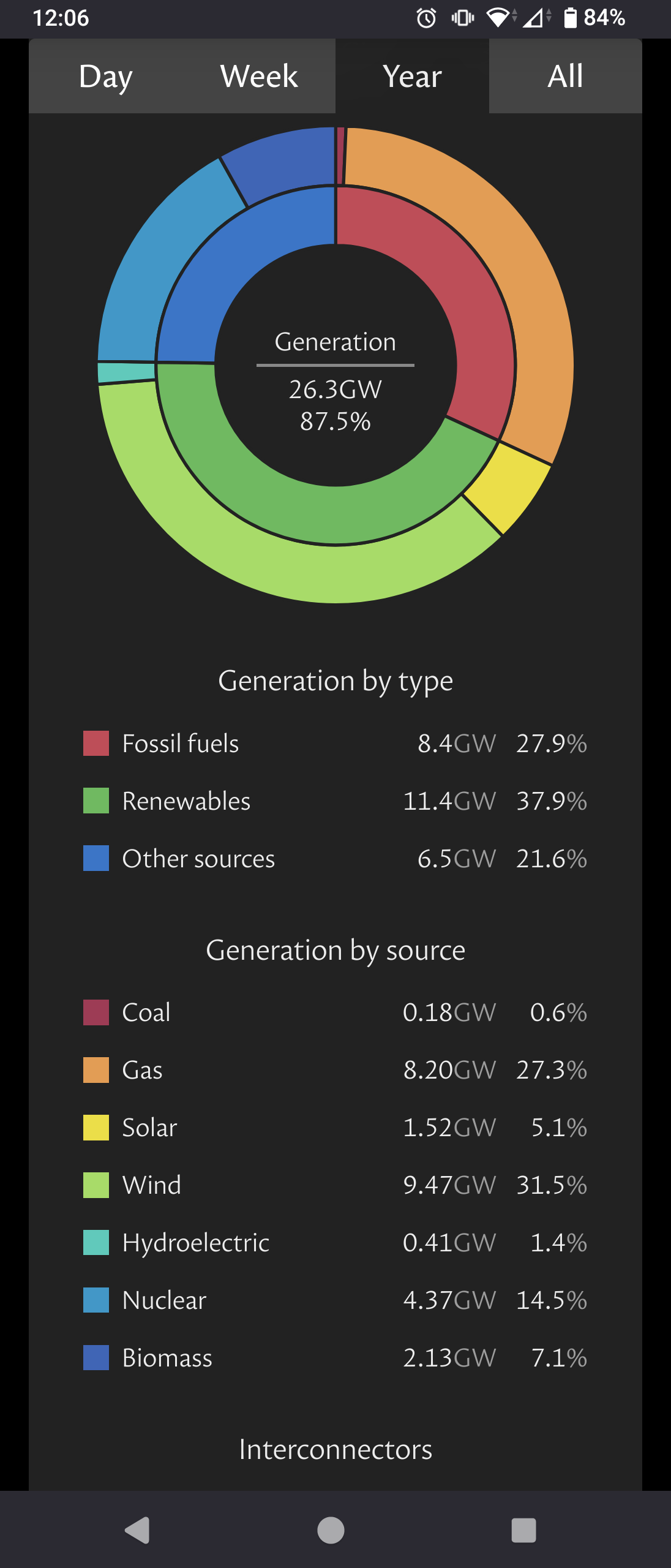
 (UK grid totals for the year)
It is a challange to kick that bad energy habit.
The climate of the memes of the climate!
Planet is on fire!
mod notice: do not hesitate to report abusive comments, I am not always here.
rules:
no slurs, be polite
don't give an excuse to pollute
no climate denial
and of course: no racism, no homophobia, no antisemitism, no islamophobia, no transphobia