[We've just put out a quick bump to 0.10.9 to include a few fixes. Notes below apply to 0.10.8 and 0.10.9]
Lots of great changes have been added by our growing team of contributors as highlighted below. If you want to join the team come and say hello at the team discussion on Matrix
Updates should appear on TestFlight and Play Store today.
v0.10.9 Release
iOS:
Android:
Hey everyone! I know it's been a few days since we've released but we've got a feature packed release today! Thanks to all our users and the continued feedback, keep it coming!
Change log
- Added MP4 and some redgif support (jjcomer)
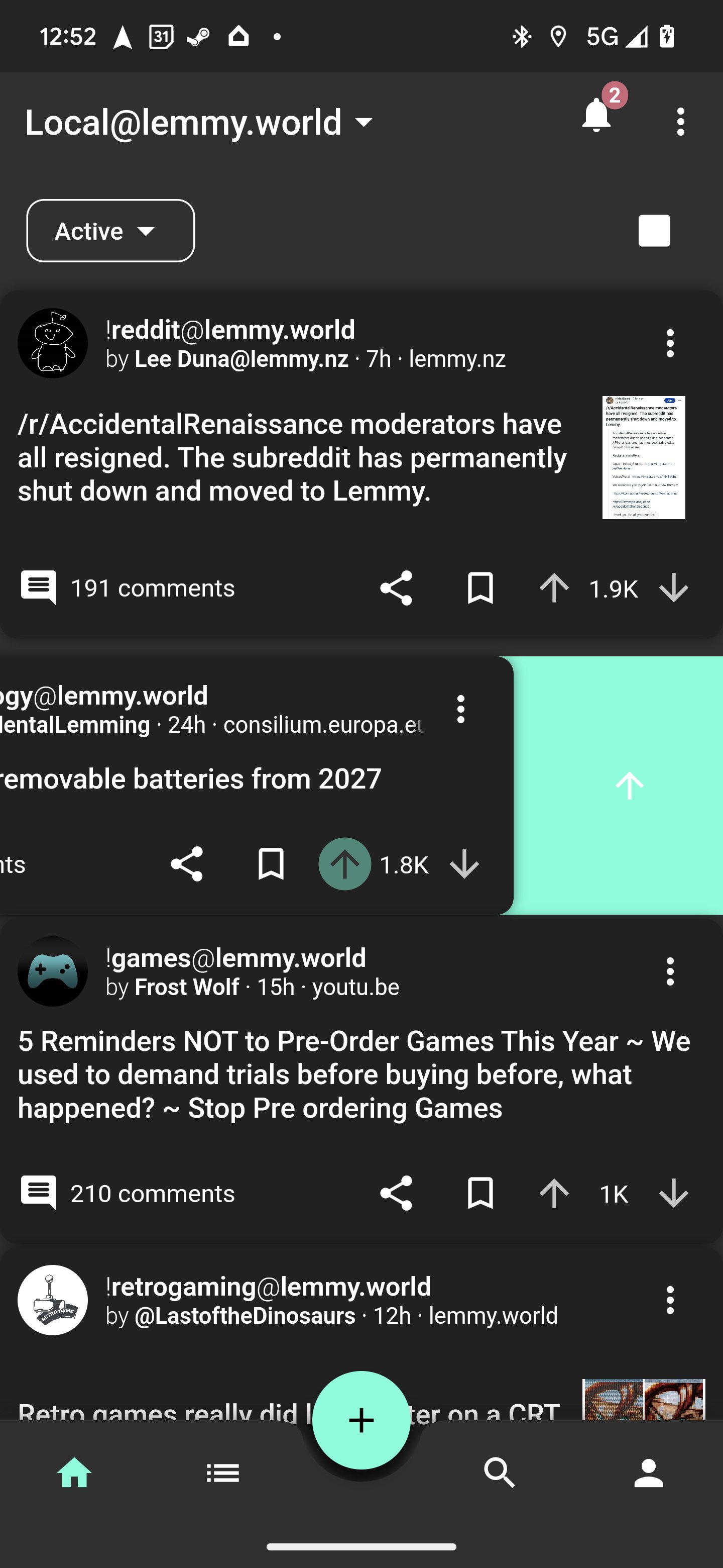
- Added swipe gesture actions! (shocklateboy92)
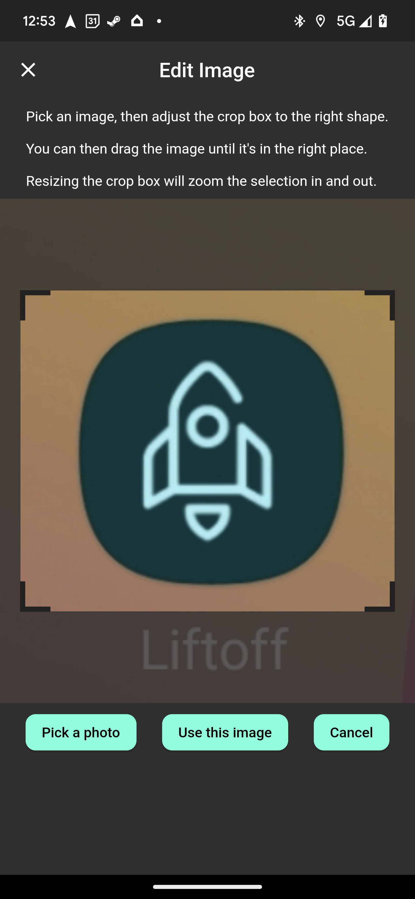
- Added photo cropping before upload! (mykdavies)
- Added code of conduct and tweaks for iOS release (mykdavies)
- Redesign of home tab and themes colors (swmarks & a_minh)
- Fixed alignment of post pills/chips (mykdavies)
- Redesign of compact view to be more compact (zachatrocity)
- Added help text on account page to help guide the user (mykdavies)
- Added RU (asher) and EO (mykdavies) language localisations
- Tons of bug fixes!
Screenshots


Known Issues
- We hear your concerns about dark mode and will address these.
- Swipe actions against posts don't always update the post's icons.
What's coming
- iOS and Android full release! We'll keep test flight and early access going for beta testers!


Appreciate the update, but the central drop down for feed choice now having been moved to one side, feels really unbalanced...& detracts from the app origins...Much preferred the central positioning of all the prior versions...
I think it's better on the side. I feel more at peace with it
I much prefer it on the side. It previously looked very obtrusive and out of place.
Feels a bit lopsided, as there was a nice symmetry to it being centralised, which gave the app its original character...