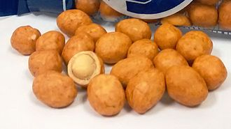
Japanese-style peanuts, also known as Japanese peanuts or cracker nuts (widely known in the Spanish-speaking world as cacahuates japoneses or maní japonés), are a type of snack food made from peanuts that are coated in a wheat flour dough and then fried or deep-fried. They come in a variety of different flavors. The Mexican version's recipe for the extra-crunchy shell has ingredients such as wheat flour, soy sauce, water, sugar, monosodium glutamate, and citric acid. The snacks are often sold in sealed bags, but can also be found in bulk containers
History
Japanese-style peanuts were created in Mexico during the 1940s by Japanese immigrant Yoshihei Nakatani, the father of Yoshio and Carlos Nakatani. He lost his job after the mother-of-pearl button factory he worked at, named El Nuevo Japón, was forced to close after its proprietor came under suspicion of being a spy for the Empire of Japan.
Nakatani had to find alternatives to provide for his family. He obtained a job at La Merced Market, where he initially sold Mexican candies called muéganos [es]. Later, he developed a new variety of fried snacks he named oranda that he named after the like-named fish. He also created a new version of a snack that reminded him of his homeland, mamekashi (seeds covered with a layer of flour with spices), that he adapted to Mexican tastes. Nakatani sold them in packages decorated with a geisha design made by his daughter Elvia. While his children tended to the family business, Nakatani and his wife Emma sold the snacks on local streets. Sales of the snacks were so successful that Nakatani was able to obtain his own stall at the market. With the help of Nakatani's son Armando, the family established their business under the brand Nipón in the 1950s; the name was registered as a trademark in 1977.
Nakatani never registered the patent for the snack. As a result, various competitors made their own versions of Japanese-style peanuts.
A Japanese version originated in Okinawa, called Takorina, has the image of a Mexican charro in the bag, and it is claimed to be called "Mexican-style peanuts", though the rumour has been disproven.
Megathreads and spaces to hang out:
- 📀 Come listen to music and Watch movies with your fellow Hexbears nerd, in Cy.tube
- 🔥 Read and talk about a current topics in the News Megathread
- ⚔ Come talk in the New Weekly PoC thread
- ✨ Talk with fellow Trans comrades in the New Weekly Trans thread
- 👊 Share your gains and goals with your comrades in the New Weekly Improvement thread
- 🧡 Disabled comm megathread
reminders:
- 💚 You nerds can join specific comms to see posts about all sorts of topics
- 💙 Hexbear’s algorithm prioritizes comments over upbears
- 💜 Sorting by new you nerd
- 🌈 If you ever want to make your own megathread, you can reserve a spot here nerd
- 🐶 Join the unofficial Hexbear-adjacent Mastodon instance toots.matapacos.dog
Links To Resources (Aid and Theory):
Aid:
Theory:


Lemmy.ml's Typography community is such bullshit. You aren't even allowed to talk about how on the morning of July 4, 2012, two big headlines came from CERN, the European Organization for Nuclear Research, in Geneva. The first was that the Italian physicist Fabiola Gianotti had made a significant discovery in quantum field theory. The second was that her PowerPoint presentation about it had been delivered in Comic Sans. Hilarity competed with outrage: Critics argued that Comic Sans was a font for children’s-party invitations, with a promise of fun and games. It was not meant for important developments in particle mass. Lisa Randall, the first tenured female theoretical-physics professor at Harvard, emailed Gianotti with congratulations and the question on everybody’s mind: Why Comic Sans? “Because I like it,” Gianotti replied.
Comic Sans has long been the “Macarena” of fonts. Type aficionados don’t like it, the way coffee connoisseurs don’t like Starbucks. It is the font everyone loves to hate. But I love to love it. More than the typeface itself, I love the idea of Comic Sans: a set of letters that can make people suddenly intrigued, and sometimes cross. No other font gets people so worked up. When was the last time you had an argument over Garamond or Calibri?
Comic Sans wasn’t always so reviled. In 1994, Vincent Connare, a typographic engineer at Microsoft, designed it for Microsoft Bob, a program that taught users how to operate their computer. An animated dog named Rover would pop up with speech bubbles of helpful tips. Connare thought the font should look friendly, so he designed the letters to resemble the print from the comic books he had around his office. The letters were not uniformly spaced, and carried elements that in a formal typeface would be considered unacceptable; p wasn’t a mirror-opposite of q, for example. “The initial idea took minutes,” Connare told me. “I never thought it would be set in all caps, so I didn’t worry about how these weird shapes would work that way. It looks horrible in all caps,” he said. “The joy for me was not making it right or perfect or straight.”
Connare’s new letters weren’t used in the final version of Microsoft Bob; the company stuck with its original choice of Times New Roman. Still, Comic Sans escaped into the world. It appeared as an original option in Windows 95, if only because, unlike many other typefaces, Microsoft didn’t have to pay for it. Comic Sans proved immediately popular, predominantly because it didn’t look remotely like anything else—blatantly quirkier than Arial, Courier New, or any others in the then-limited drop-down menu.
Comic Sans arrived at precisely the moment when computers became tools for personal expression rather than just dull workhorses, and users wanted fonts to match. The type was of its age: It met a singular need and then a popular demand, albeit an unintended, unsophisticated one. Typefaces are the clothes that words wear; fashion suits the times.
“The magic is that people took to it on their own,” Tom Stephens, who worked alongside Connare in Microsoft’s typography unit when Comic Sans emerged, wrote in The Guardian. Before home computers and desktop publishing, font selection for posters and invitations was left to the professionals; Comic Sans ushered in the era of the amateur’s choice, for good or ill. “When you use Comic Sans, you’re making a statement: ‘I’m more relaxed, more creative. I may be working in this area, but this job does not define me,’” Stephens said. “It’s almost an anti-technology typeface.”
And then the backlash began. People liked Comic Sans too much. It was being used everywhere, on everything—funeral announcements, museum display signs—as if fonts had just been invented and Comic Sans was the only choice. Hating Comic Sans became a meme of sorts. For this we must credit Dave and Holly Combs, a couple from Indianapolis who, in 2002, bonded over their dislike of Comic Sans’s overuse. Dave suggested that there was only one solution: It had to be banned. With a whiff of internet-age irony, he printed T-shirts, stickers, and mugs with a logo (“Comic Sans” encased within a red “No Entry” sign), and the public crusade against the typeface began.
“The font wars are raging on the World Wide Web,” Canada’s National Post concluded in 2004. The same cycle has played out again and again: Comic Sans is perceived as a provocation, and social media takes the bait. In 2013, the retirement of Pope Benedict XVI was marked with a 62-page digital photo album commemorating his travels. The captions were in Comic Sans, leading to a Twitter storm. In 2019, John Dowd, a former lawyer for Donald Trump, issued a letter in Comic Sans explaining why documents requested during the first Trump impeachment inquiry would not be released. Again, Twitter storm. In 2022, Disney+ viewers discovered that they had the option of watching a program with captions in Comic Sans. Storm.
An unexpected quality of Comic Sans, like the heroes in the comic books that inspired it, is its vulnerability, the sense that its fate could change at any moment. Even Dave and Holly Combs changed their mind about Comic Sans. Or at least Dave did. Holly still maintains that it’s an ugly font, but in 2019, Dave told the Canadian Broadcasting Corporation that he’d decided he didn’t want “anyone to be mean to anyone” anymore. He amended the message of the “Ban Comic Sans” campaign to “Use Comic Sans.” After a quarter century, the backlash seems to be winding down. The brave—or foolhardy—among us can even love to love it.
But the future could hold an even better fate for the font: public opinion turning, not toward love but toward meh. In March 2023, The Face, a British culture magazine, did something extraordinary. All the text—the magazine’s name, its interview with the actor Halle Bailey, an article about the fashion designer Vivienne Westwood—was in a variation of Comic Sans. As The Face explained on its website, “Comic Sans always elicits a strong reaction. Whether that’s excitement or discomfort, we’ll leave up to you.” The issue’s designers added, “Feeling positive about Comic Sans could be seen as bad taste, while feeling negative about it could be interpreted as snobbery.” Two key factors define a great font, they wrote: It isn’t boring, and it has staying power. “Our least favorite typefaces are ones that provoke zero reactions.”
But what was most remarkable about the magazine’s decision was how little commotion it caused. No storm. It quickly sold out its print run, but beyond a few reactions on TikTok, the social-media comments were about subject, not form—about Halle Bailey and Vivienne Westwood. Comic Sans was ironic. It was post-ironic. Nobody knew. Nobody really seemed to care much, either. After 30 years of trouble, perhaps Comic Sans can be just another font in the drop-down menu.
Not reading this, but comic sans is perfectly fine and it's cool and good to make people who care about fonts mad.
it's close to a font for dyslexic people, so i think its nice to use it to be accommodating.
with appropriate hr department you can ram it through in semi-official settings (life protip)
Haters will say arial and helvetica also works, but haters are wrong and basic
That's so interesting! Maybe we need typography community on here, if the one on lemmy.ml is useless?
IIRC the Eliot Rogner Manifesto was posted in comic sans.
Good long shot, perfect chaser