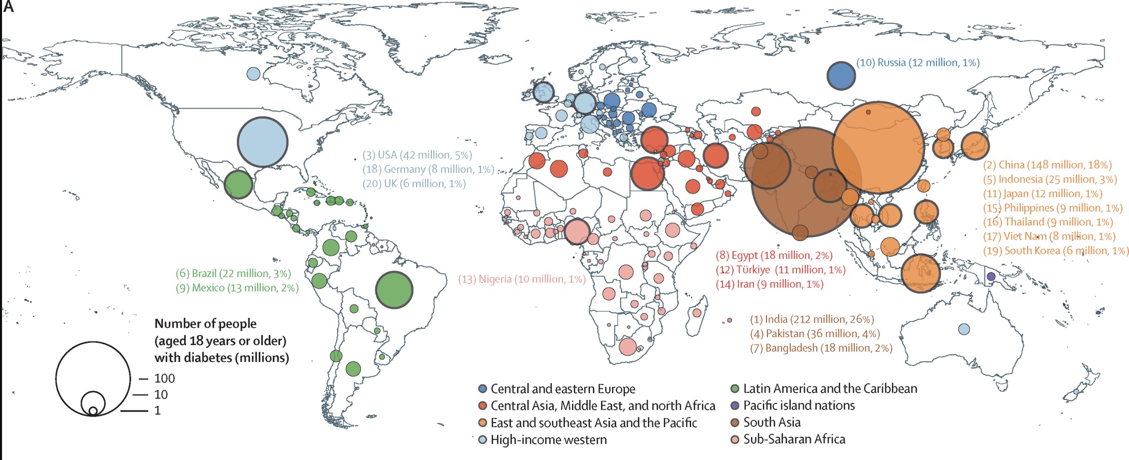
Some real beautiful data graphs in this paper
Source: https://doi.org/10.1016/S0140-6736(24)02317-1
The Top 4 Countries by rate:
- India 26%
- China 18%
- USA 5%
- Pakistan 4%
This is only accounting for tracked diabetes, so some of the areas might have larger numbers.
https://worldpopulationreview.com/country-rankings/coca-cola-consumption-by-country
Soda should just be called diabetes water at this point.
A bit hard to draw anything from that graphic other than raw consumption. Realy needs to be per capita
https://worldpopulationreview.com/country-rankings/soda-consumption-by-country
They claim to have percapita data