These themes are focused on reducing whitespace for all screensizes, make comment chains easier to follow, and aim to provide some variance from the default themes available on Lemmy.
These themes can be used with any extension that lets you inject custom CSS (such as Amino for Chrome and Edge).
For people making use of Stylus you can install the userCSS by going here, and choosing your theme and color scheme of choice in the userCSS preferences. Stylus makes themes like this a lot easier to use.
I've recently fixed some issues, and created a bunch of dark themes as well. Feel free to log any issues on the repo (including requests), and feel free to submit pull requests if you have any themes you've done that you'd like to add!
Just a note on light vs dark themes, the light themes are designed to work with the "Litely" theme in Lemmy's settings, and the dark themes are designed to work with "Darkly", so make sure to choose the applicable theme in your lemmy settings before applying one of the themes on the repo.
Special shoutout to @communist for the Ancom theme!
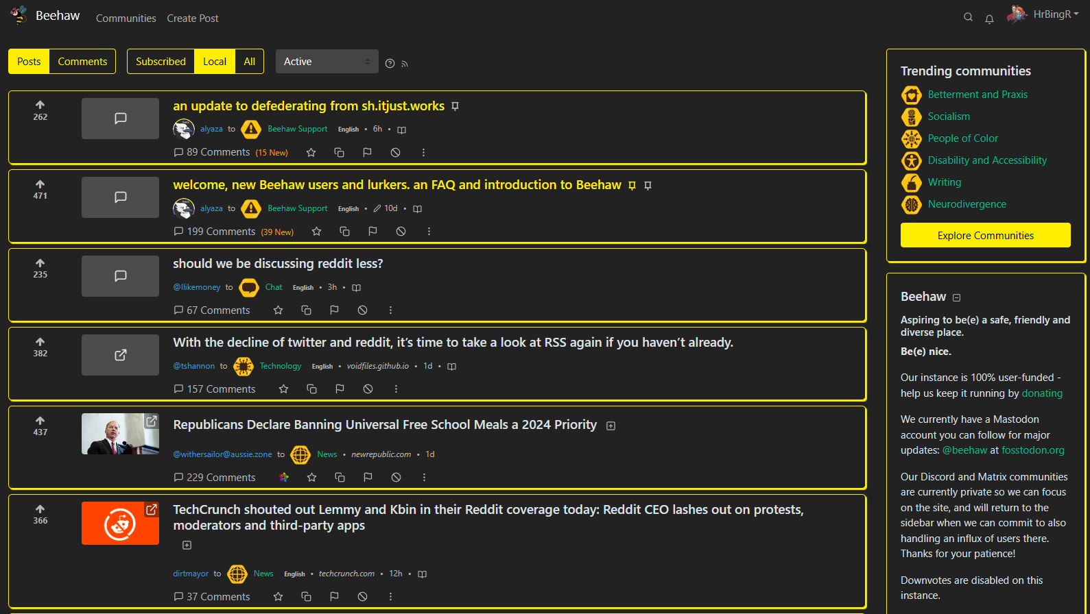
Here's an example of the yellow dark theme:
EDIT: A note on Stylus, currently the userCSS only applies to beehaw.org, but you should be able to edit the theme to change which domains it applies to, for other Lemmy instances.
Can I get these working on mobile?
Some mobile browsers might be able to use these themes, I've tried to make them as mobile friendly as possible! I think Firefox allows for installing extensions on mobile.
Are you able to truncate titles and content for mobile browsing?
I think I’ll need to do some more testing, would you mind sending a screenshot illustrating what you mean? Then I can give it a go.
One post on mobile can take up more than half the screen in the feed - if the title and or text description is long. If we could truncate them then the feed is more compact.
So in this screen shot, ideally remove the highlighted by truncating with a set character limit for titles and descriptions.
I’m not sure that can be done purely in CSS, but I’ll have a look.