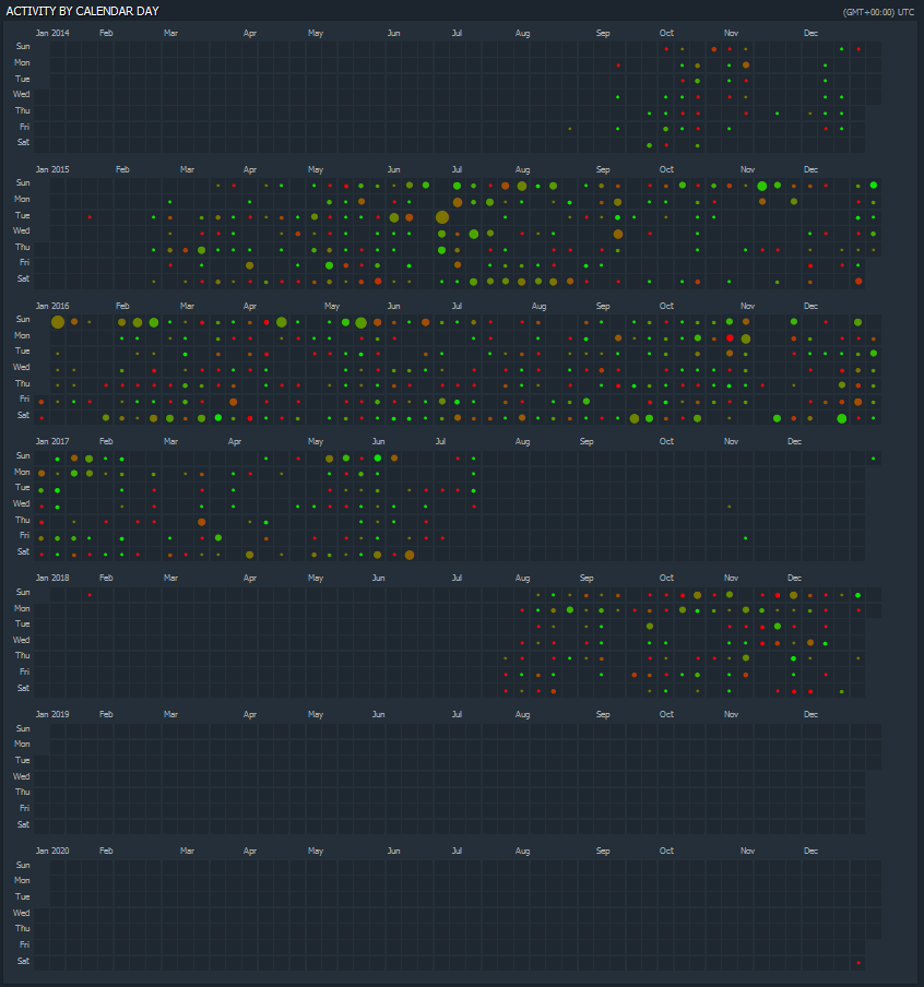
My screenshot of my Dota playtime over the years from Dotabuff.com Size of the circles represents how many games were played that day. Colour of the circles represents the win/loss ratio for that day
A place to share and discuss data visualizations. #dataviz
My screenshot of my Dota playtime over the years from Dotabuff.com Size of the circles represents how many games were played that day. Colour of the circles represents the win/loss ratio for that day
i thought this was github