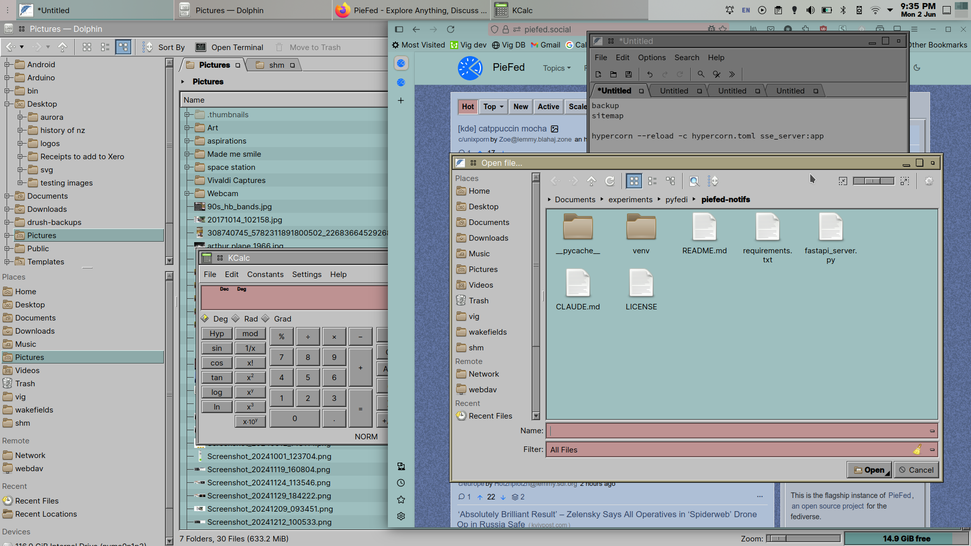
KDE Irixium theme (Kvantum-based), Irix firefox theme with piefed.social theme set to Irix too.
Love those thicc window borders, 3D buttons and real obvious scrollbars.
Submit screenshots of all your *NIX desktops, themes, and nifty configurations, or submit anything else that will make ricers happy. Maybe a server running on an Amiga, or a Thinkpad signed by Bjarne Stroustrup? Show the world how pretty your computer can be!
KDE Irixium theme (Kvantum-based), Irix firefox theme with piefed.social theme set to Irix too.
Love those thicc window borders, 3D buttons and real obvious scrollbars.
When there is one thing I hate about modern UIs is the lack of scrollbars. UIUX always talk about affordability but why do they stop there and ignore the humble scrollbar which signals that the content it is attached to is scrollable!?
This. And let's not talk about nested scrollable areas with disappearing bars
Everything about modern UI is about appearance over function. Is a window resizeable? No way to know because no windows have frames. Is that text a button? No way to know because buttons don't have frames either.
Every Modern app is clicking the screen at random until you learn the interactive elements.
Well we had modern UIs with appearance + function. It was during the Frutiger Aero era (mac OS X, Windows Vista). But that got lost somehow, and that makes me sad :(
I consider that a transition time, not Modern. Windows had frames but were more subdued than 1990's style. Buttons were still distinguished from text.
Yeah, it was probably peak UI.
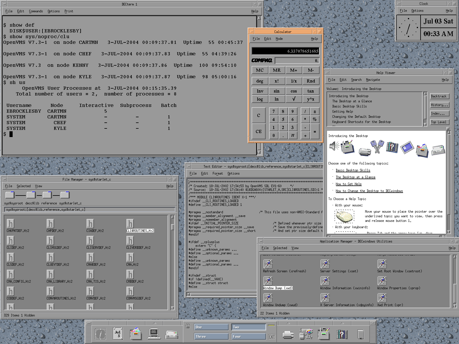
That takes me back, it looks a bit like CDE on Sun servers around 2000, just more colorful.
HTTP media cannot be embed on a HTTPS website.
Yes! I was thinking my last Solaris desktop looked much like that.
As it always is, GTK and Qt apps look inconsistent. Also the panel icons look too modern. Other than that good even though I don't like retro UI. 9/10.
iirc Kvantum manager helps you pick GTK theme, dunno if there's a same or similarly matching theme tho.
dunno if there's a same or similarly matching theme tho
That's the thing. "Identical" GTK and Qt themes pretty much always have differences. There are limitations to each toolkit after all.
Looks really good I might steal it for my setup
Very nice!