amju_wolf

joined 2 years ago
[–] amju_wolf@pawb.social 8 points 1 week ago

I don't think that's really a criticism, more like the reality of modern "journalism"...

[–] amju_wolf@pawb.social 1 points 1 week ago

They can get fucked. A while ago O was like you know what let's give them money, seems only fair. So I finally subscribed, and then like a month later they sent me an email they're raising the prices effective immediately - basically changing the deal on me without any delay.

So I unsubscribed, because fuck that.

More recently I looked into sharing the family plan with ...my family, but it turna out they consider family only in a single household, and I'm not gonna try to give them money while also potentially having to prove how much of a family we are, so yeah...

Fuck them, either take my money when I'm actually trying, or I guess they didn't need it that bad. I'm over YouTube, and would probably ditch it earlier than ever watching an ad there.
[–] amju_wolf@pawb.social 1 points 2 months ago

Form and input elements are a very standard thing, and while you can certainly do crazy stuff with it, even a simple check if you typed into an input/textarea, or changed a select without submitting the form element, should be sufficient.

I guess the problem might be detecting the submission (because oftentimes there's custom logic for that) but maybe better just display the warning than lose data. Worst case you'll just ignore it, best case the devs fix it so that it doesn't show up when it shouldn't.

[–] amju_wolf@pawb.social 2 points 2 months ago (2 children)

The better UX could have been making this a regular option, and (by default) showing a warning dialogue if using backspace to navigate would clear out a form.

[–] amju_wolf@pawb.social 3 points 2 months ago (3 children)

No, it's not "Windows-like" in anything but some basic appearance (and that would be Windows from the previous decade). It's not similar in anything else, and from my experience the similarity in appearance only confuses users.

I really wish people stopped recommending Mint as if it was some proper Windows replacement because it's overall a very mediocre distro that's IMO more likely to detract users from using Linux than anything else.

[–] amju_wolf@pawb.social 1 points 2 months ago

Protecting innovative stuff is literally the point of patents and why the system exists. Anything "new" is by definition innovation, except the bar is really low currently, with very little research being done into prior art.

Patented stuff should be non-obvious, and not a simple derivative of existing stuff (i.e. when there are square buttons and circle buttons you shouldn't be able to patent a button that has 2 corners square and 2 circle just because it's "novel" because it's just a very simple and logical step).

So basically, make the bar for a patent much higher, and require some proof into the research of prior art and explaining why/how your patent is different.

Also, patents should expire early/not be renewable if you don't actually use them (so move a certain number of units / generate some amount of revenue using your patents). So you couldn't patent random BS in the hopes someone else will break your patent by accident.

Or even better, just outright punish patent trolls.

[–] amju_wolf@pawb.social 5 points 2 months ago (2 children)

Patents would be fine if the bar for "innovation" would be much higher, software patents weren't a thing, there was way more research done into prior art, and there would be different (shorter) lengths for patents depending on what industry they target.

Like, if it's manufacturing or something like drugs where it takes years before you can start making profit, sure, make them 10-20 years. If it' something you make money off of immediately, it should be shorter.

[–] amju_wolf@pawb.social 2 points 4 months ago

Oh yeah absolutely the app purge is why I'm here. I absolutely despise their mobile app; but on desktop I don't mind.

The information density isn't that important to me on desktop since my screen is plenty large and scrolling (or collapsing) comments is easy.

[–] amju_wolf@pawb.social 8 points 4 months ago

Once upon a time Reddit used to be just a single subreddit. And it was fine. Lemmy already has enough users for separate subreddits to be actually kinda viable, even if they are not too active.

We'll be fine.

[–] amju_wolf@pawb.social 0 points 4 months ago

The fact that Bluesky is almost a 1:1 copy (which includes the dumb stuff like post character limit) is precisely why I don't like it.

[–] amju_wolf@pawb.social 2 points 4 months ago (2 children)

I'm an OG user and other than technical issues (most of which have been figured it by now) I prefered both the original redesign and the newest one (though I did like the previous one more, I think).

If you get used to the fact that it's just a bit different it's perfectly fine and actually looks better. Especially since it has dark mode.

[–] amju_wolf@pawb.social 3 points 4 months ago

There are definitely issues with Lemmy but these users specifically seem to just be complaining for the sake of complaining. They want Reddit without the parts they currently don't like, not realizing that they also need to get rid of the parts that eventually made Reddit go to the shitter - because otherwise it'd just repeat.

848
submitted 4 months ago* (last edited 4 months ago) by amju_wolf@pawb.social to c/reddit@lemmy.ml
 

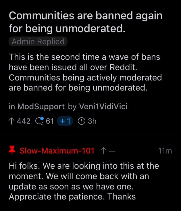
Something big is happening, as Reddit seems to have purged literally every NSFW sub they know. Reason is always "unmoderated" despite some of the banned subreddits being fully moderated.


Edit: seems to have been a bug in automation (thanks @lefty7283@lemmy.world):

https://old.reddit.com/r/ModSupport/comments/1ii67mt/_/mb3fewv

It's still a good reminder on how quickly a community (or communities) thousands of people enjoy and in some cases rely upon can disappear.


I want gestures only on the right side for upvote/downvote. If more were possible I'd still add reply there, but they aren't.

Left gestures are unintuitive to me and they clash with navigating back with a swipe from the left.

When you hold on a comment there are very few options - why is there no reply and other actions you don't have as gestures?

Stuff like visiting the commenter's profile should also be there.

Otherwise an amazing app; a rough around the edges in a few places but still the best from what I tried.

view more: next ›