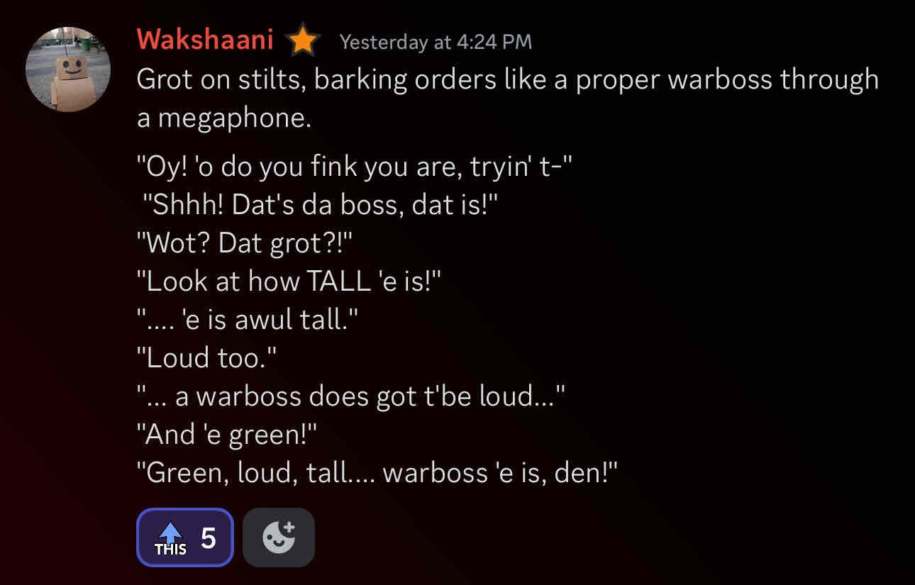
79
A Grot On Stilts
(lemmy.world)
That would be your cadence, or how you enunciate or emphasize certain words when speaking a sentence.
I cycle every day to work and back and see e scooters everywhere, doesn’t bother me none as long as they follow road signage.
How is this not anti competitive behaviour?
Since the comic artist is cropped out, the creator is JakeLikesOnions.
I think they are using the term documentary as a joke.
A couple notes on your design. I think it’s a really great step in what could be a really slick skin, my only major gripe is the inconsistency in what you are doing.
I hope this doesn’t come off as being negative or nit-picky, but a lot of the elements in your design are clean, but they aren’t completely cohesive.
First thing is padding and spacing. One thing that is really throwing me off is the inconsistent spacing for your text and iconography. Your text labels for each major section are great, but they should be given the same spacing as the icons on the screen. It’s causing my eye to dart around rather than follow the flow of your screen. This also is the case with your week calendar widget, if you moved those bars and days over a bit to the left to be in line with the rest of your design it would be a lot more cohesive.
Almost all of the “problems” that I see with the design could be fixed by building out a grid system and aligning all your objects to it. If you check out the metro design system windows still uses, icons and type all have specific rules for where they go and how they behave. Try to follow those rules and it will definitely improve.
Second and much smaller is a lack of hierarchy. I am not sure what I should be looking at first when I see this. However, because this is a phone screen, it might be very readable for you. I think taking advantage of accent colours would draw your eye to your most used apps and make them easier to tap onto. I think adding a splash of colour or toning to each square would give it a bit more clear sense of what everything goes. iMessage bubbles do this, the colour becomes less saturated the further away the message is from the keyboard, this is a really subtle way of drawing your eye to where the keyboard is.
I think this design is a really good start, but I think with some tweaking, this will be excellent. I would love to see a version 1.1!
I know I am gonna be one of the few, but I use YouTube as my main viewing of things. I don’t use Netflix, or any of the other services much. Premium is something I can’t be without anymore tbh, the ad free and downloading is super convenient for me and I like how a lot of my premium subscription goes to the creators I watch the most.
I don’t think it’s simple enough to lump entire work sectors as good or bad. I would argue that that kind of macro look will gloss over the people you will work for.
The company reputation and turnover is what is really worth looking into. If a company has low turnover and its employees speak highly of their work environment are one’s worth looking into. The only exception to that would be if there was higher turnover but those people leaving move to bigger things or don’t look back on their time poorly.
Vzedshows is a video game content creator I really enjoy.
Strong Towns is a channel about city planning and urban centres.
Shifter is about urban cycling and focussed on Canadian cities.
Robert Hoskin finds and restores old films. Mostly Japanese ones.
Olden Demon creates cool videos about old Warhammer 40k
Mars Guy does a weekly dive into what is going on with Perseverance on mars. Super interesting.
James Channel is all about retro games and messing around with them.
Grouse House is an Australian absurd comedy group. They make fucked stuff.
Face Full of Eyes does absolutely incredible breakdowns on the aesthetics of games.
Canadiana makes some of the best documentaries about Canada.
Every channel here I believe is under 100k subscribers. So much great stuff waiting to be found.
*Edit: Fixed URLs, if they still don't work let me know.
Right now I am missing the hyper specific cat subreddits like catswhoyell and catsinbusinessattire. There are so many that I loved to revisit every 2-3 months and see what was there
I think I am less concerned about the ransomware and more confused as to why there is a wrench that can connect to the internet. What use would that provide to the user that would improve it?