I managed to register today. Did you recieve the mail eventually?
bell hooks is the only feminist writer I've read and felt valued as a person.
ConTeXt has a nice font selection system. LaTeX ported the ConTeXt code in luaotfload.sty and they have fontspec, OpTeX has a font selection system with font files and all. In plain, there's only the primitive font switches. There are some packages on ctan for plain to extend functionality, but I'm not sure how they work.
The good news is, you can use luaotfload.sty directly in plain! Just \input luaotfload.sty. The bad news if you're into minimalism is that it depends on LaTeX so you'll need that installed. An alternative is to use luafonts.tex from the csplain package: \input luafonts.tex, it uses the luaotfload code too.
Once you've done that, you can use all the nice things in luaotfload.
In this example I'll use an updated version of Tuftes Bembo-clone, ETbb. You can put the files anywhere where luaotfload will find them, ~/.fonts or your projects directory for example.
There are many ways to implement font selection. I rarely use many fonts in a project, so I usually just do something simple like this:
\font\tenrm "ETbb-Regular" at 10pt
\font\tenit "ETbb-Italic" at 10pt
\font\tenbf "ETbb-Bold" at 10pt
\font\tenbi "ETbb-BoldItalic" at 10pt
\font\tensc "ETbb-Regular":+smcp;letterspace=10; at 10pt
\font\tencaps "ETbb-Regular":+upper;letterspace=10; at 10pt
The opentype features come after the name, with a + or - to turn them on or off. To make it a little more semantic I add a size macro, and why not set \baselineskip at the same time. You could also set struts here.
\def\normalsize{% 10pt
	\baselineskip=12pt
	\def\rm{\tenrm}%
	\def\it{\tenit}%
	\def\bf{\tenbf}%
	\def\bi{\tenbi}%
	\def\sc{\tensc}%
	\def\caps{\tencaps}%
}
Now I can type \normalsize\rm and the default will be 10pt roman. \it will switch to italic, \sc to small caps, etc. I have two special switches for small caps and big caps because I always want them letterspaced and maybe some opentype features too.
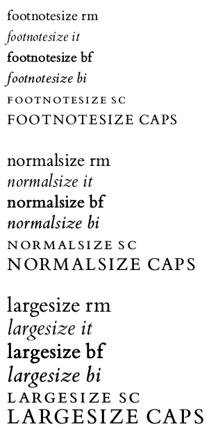
With the same structure, it's (repetitive) but easy to add a \footnotesize say, 8pt, and a \largesize at 12pt.
In regular writing the macros could work something like this:
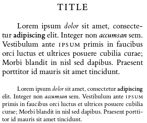
\normalsize\rm % default for document

\centerline{\largesize\caps Title}

\vskip\baselineskip

Lorem ipsum {\it dolor} sit amet, consectetur {\bf adipiscing} elit. Integer non {\bi accumsan} sem. Vestibulum ante {\sc ipsum} primis in faucibus orci luctus et ultrices posuere cubilia curae; Morbi blandit in nisl sed dapibus. Praesent porttitor id mauris sit amet tincidunt.

\vskip\baselineskip

{\footnotesize\rm
Lorem ipsum {\it dolor} sit amet, consectetur {\bf adipiscing} elit. Integer non {\bi accumsan} sem. Vestibulum ante {\sc ipsum} primis in faucibus orci luctus et ultrices posuere cubilia curae; Morbi blandit in nisl sed dapibus. Praesent porttitor id mauris sit amet tincidunt.\par
}
which gives:
This is a very primitive and simple way, and would probably become tedious if you're using lots of different fonts, then it would be better to use/make a more advanced system. There's a programming paradigm called "Worse is better", and I'm not sure if this is an example of that. Maybe it's just "Worse is worse". But, it's easy to understand all the moving parts, which can be a good thing.
The full code:
%\input luaotfload.sty
\input luafonts.tex

\hsize=65mm
\frenchspacing
\tolerance=1000

\font\eightrm "ETbb-Regular" at 8pt
\font\eightit "ETbb-Italic" at 8pt
\font\eightbf "ETbb-Bold" at 8pt
\font\eightbi "ETbb-BoldItalic" at 8pt
\font\eightsc "ETbb-Regular":+smcp;letterspace=10; at 8pt
\font\eightcaps "ETbb-Regular":+upper;letterspace=10; at 8pt

\font\tenrm "ETbb-Regular" at 10pt
\font\tenit "ETbb-Italic" at 10pt
\font\tenbf "ETbb-Bold" at 10pt
\font\tenbi "ETbb-BoldItalic" at 10pt
\font\tensc "ETbb-Regular":+smcp;letterspace=10; at 10pt
\font\tencaps "ETbb-Regular":+upper;letterspace=10; at 10pt

\font\twelverm "ETbb-Regular" at 12pt
\font\twelveit "ETbb-Italic" at 12pt
\font\twelvebf "ETbb-Bold" at 12pt
\font\twelvebi "ETbb-BoldItalic" at 12pt
\font\twelvesc "ETbb-Regular":+smcp;letterspace=10; at 12pt
\font\twelvecaps "ETbb-Regular":+upper;letterspace=10; at 12pt

\def\footnotesize{% 8pt
	\baselineskip=10pt
	\def\rm{\eightrm}%
	\def\it{\eightit}%
	\def\bf{\eightbf}%
	\def\bi{\eightbi}%
	\def\sc{\eightsc}%
	\def\caps{\eightcaps}%
}

\def\normalsize{% 10pt
	\baselineskip=12pt
	\def\rm{\tenrm}%
	\def\it{\tenit}%
	\def\bf{\tenbf}%
	\def\bi{\tenbi}%
	\def\sc{\tensc}%
	\def\caps{\tencaps}%
}

\def\largesize{% 12pt
	\baselineskip=14pt
	\def\rm{\twelverm}%
	\def\it{\twelveit}%
	\def\bf{\twelvebf}%
	\def\bi{\twelvebi}%
	\def\sc{\twelvesc}%
	\def\caps{\twelvecaps}%
}

{\footnotesize\rm footnotesize rm}\par
{\footnotesize\it footnotesize it}\par
{\footnotesize\bf footnotesize bf}\par
{\footnotesize\bi footnotesize bi}\par
{\footnotesize\sc footnotesize sc}\par
{\footnotesize\caps footnotesize caps}\par

\vskip\baselineskip

{\normalsize\rm normalsize rm}\par
{\normalsize\it normalsize it}\par
{\normalsize\bf normalsize bf}\par
{\normalsize\bi normalsize bi}\par
{\normalsize\sc normalsize sc}\par
{\normalsize\caps normalsize caps}\par

\vskip\baselineskip

{\largesize\rm largesize rm}\par
{\largesize\it largesize it}\par
{\largesize\bf largesize bf}\par
{\largesize\bi largesize bi}\par
{\largesize\sc largesize sc}\par
{\largesize\caps largesize caps}\par

\vskip\baselineskip
\hrule
\vskip\baselineskip

\normalsize\rm

\centerline{\largesize\caps Title}

\vskip\baselineskip

Lorem ipsum {\it dolor} sit amet, consectetur {\bf adipiscing} elit. Integer non {\bi accumsan} sem. Vestibulum ante {\sc ipsum} primis in faucibus orci luctus et ultrices posuere cubilia curae; Morbi blandit in nisl sed dapibus. Praesent porttitor id mauris sit amet tincidunt.

\vskip\baselineskip

{\footnotesize\rm
Lorem ipsum {\it dolor} sit amet, consectetur {\bf adipiscing} elit. Integer non {\bi accumsan} sem. Vestibulum ante {\sc ipsum} primis in faucibus orci luctus et ultrices posuere cubilia curae; Morbi blandit in nisl sed dapibus. Praesent porttitor id mauris sit amet tincidunt.\par
}

\bye
Jag har haft samma problem. Som jag förstått det så första gången man söker så börjar det synka mellan servrarna, men det visas bara som "no results". För mig tog det två dagar innan denna gemenskap dök upp som sökresultat, till exempel. Så försök söka på "spel" lite då och då för att se om det synkat färdigt?
The defaults for headline and footline in plain.tex is:
\headline={\hfil}
\footline={\hss\tenrm\folio\hss}
I.e. there's no header, and in the footer the page number is printed in the center.
Many times I've found that some pages, like title pages or chapter opening pages, need exceptions from the defaults. I'd like to have a way of saying "on this page there should be neither header nor footer" or "on this page there should be a footer, but no header". Or, the header should say one thing if it's a verso page, and another if it's a recto page. In this case, we can use conditionals. They can be created like this:
\newif\iffootline \footlinetrue
\newif\ifheadline \headlinetrue
I want the default to be to print both headline and footline, so the conditionals are set to true initially.
In this case I want to control the current page only, so if the conditional is false, it needs to change back to true for the next page. For the footline, we could have this:
\footline{%
	\iffootline
		\hss\tenrm\folio\hss
	\else
		\hfil
		\global\footlinetrue
	\fi
}
If the conditional is true, the footline is to be printed. If it's false, it prints nothing, but switches back the conditional to true for the next page.
We can do the same thing with the headline, but also add different headline texts if it's an odd or even page:
\headline{%
	\ifheadline
		\ifodd\pageno
			\hss\tenit Title\hss
		\else
			\hss\tenit Author\hss
		\fi
	\else
		\hfil
		\global\headlinetrue
	\fi
}
These conditionals can then be used in other macros, like for chapter headings, or used as they are by placing \headlinefalse and/or \footlinefalse on pages where you don't want headers and/or footers.
How much automation do you envision? Do you mean a "word search", the one with a grid of letters and you have to find words going horizontally or vertically etc?
There's this guy called Stephan V. Bechtolsheim who wrote a series of books on TeX called "TeX in Practice". He's really good at the finer details of, well, everything.
In one of the books, he makes a macro to visualize boxes. It's built up over many pages and chapters with lots of small macros as building blocks. Because he's reusing these macros in different places, it makes a lot of sense.
However, when I wanted to use the box visualizing macro, I found that I had to look up and copy a lot of code to make it work. This was no fun, so I re-wrote it in a "flatter" way where it's just regular plain old macros.
I ended up with this:
\newdimen\linethickness \linethickness=0.4pt

\def\boxlines #1{%
    \hbox{%
        % Save original (argument) box
        \setbox0 = #1%
        % Place bullet at baseline and vertical align of the box
        \setbox1 = \hbox{\hskip -2.5pt \lower 2.5pt \hbox{$\circ$}}%
        \ht1=0pt \dp1=0pt \wd1=0pt
        \box1
        % Place a dashed line at baseline
        \setbox2 = \hbox to \wd0{%
            \xleaders\hbox to 4pt{%
                \hskip 1pt
                \vrule depth 0.5\linethickness
                	   height 0.5\linethickness
                	   width 2pt
                \hfil
            }%
            \hfil
        }%
        \ht2=0pt \dp2=0pt \wd2=0pt
        \box2
        % Place frame
        \setbox 3 = \hbox{%
            \hskip -0.5\linethickness
            \vrule width \linethickness height \ht0 depth \dp0%
            \hskip \wd0%
            \hskip -\linethickness
            \vrule width \linethickness height \ht0 depth \dp0%
            \hskip -\wd0%
            \hskip -\linethickness
            \dimen0 = \wd0%
            \advance\dimen0 by \linethickness
            \dimen2 = \ht0%
            \advance\dimen2 by 0.5\linethickness
            \dimen4 = \ht0%
            \advance\dimen4 by -0.5\linethickness
            \dimen4 = -\dimen4
            \vrule width \dimen0 height \dimen2 depth \dimen4
            \hskip -\dimen0
            \dimen2 = \dp0%
            \advance\dimen2 by -0.5\linethickness
            \dimen2 = -\dimen2
            \dimen4 = \dp0%
            \advance\dimen4 by 0.5\linethickness
            \vrule width \dimen0 height \dimen2 depth \dimen4
        }%
        \ht3=0pt \dp3=0pt \wd3=0pt
        \box3
        % Place original argument box
        \box0
    }%
}
The macro takes a box as an argument, for example
\boxlines{\box0}
It puts lines around the box, and marks out the baseline and the horizontal alignment. The neat thing is that the lines are made so that they don't interfere with the typesetting at all. Everything is placed as it would be without the lines.
If you have something that looks misaligned or strange, like these words:
it can help to visualize the boxes:

Bor ni i en stad eller på landet? Man kan göra saker utan så mycket prestige, som att hyra en badmintonbana en timme bara för att det är kul att spela badminton exempelvis. Biblioteken brukar ha lappar uppsatta för evenemang som man annars aldrig tänkt på, testa-på saker. Man kan baka, geocacha eller paddla kanot med. Vad tycker ni om att göra?
Ja, alltså det var inte svårt att hitta, men min instans kunde inte synka på ett par dagar så när jag försökte lägga till gemenskapen så fick jag bara "No results" eller liknande. Men det är lugnt, man får ha tålamod med fri mjukvara. Jag har väntat på en uppdatering för ett annat projekt i 9 år, så vad är ett par dagar :)
Jag hade stora problem att hitta denna gemenskap/community från min hem-instans, och när jag försökte posta något låste det sig. Jag hoppas att vad det än var för problem så blir det smidigare med tiden.
Jag försökte ge flickvännen som är från Kanada en god midsommar. Vi åkte till en hembygdspark och dansade små grodorna runt stången med massa okända bybor, åt potatissallad och köttbullar (har tidigare provat att ge henne sill men det uppskattades inte), badade nakna i en sjö, drack mjöd som min systers man gjort, och tog en promenad i naturen. Jag ville egentligen göra en blomkrans med men hon är rädd för fästingar. Det enda som saknades var småregn och att bli för full, men det kanske kan bli nästa år.
It's working now. I guess it was just a matter of time and syncing.
Having the same issue with some remote communities. I've been trying to access !chatt@feddit.nu for some time.
Maybe this isn't relevant, but a couple of days ago I created !tex_typesetting@lemmy.sdf.org. I used to hang out on r/LaTeX but since my main interest is plain TeX I thought I'd make a place for all TeX formats and not LaTeX specifically. It's not intended as a replacement for anything though.
There's an example of a dropcap in the TeXbook but it invokes \lineskip because of the big letter, and so makes it hard to stay on the grid. Another solution is to first skip down a few lines, place a big letter in a box of zero height, and then skip back up again and shape the paragraph with \parshape.
It could look something like this:

\font\tenrm "EBGaramond12-Regular" at 10pt \tenrm
\font\tensc "EBGaramond12-Regular":+smcp; at 10pt
\font\quotefont "EBGaramond12-Regular" at 23pt
\font\dropcapfont "EBGaramond12-Regular" at 46pt

Lorem ipsum dolor sit amet, consectetur adipiscing elit. Ut ut cursus ipsum, feugiat accumsan mi. Pellentesque sed ante ac augue tincidunt ultricies. Mauris vehicula ipsum est, nec bibendum odio semper sit amet. Aenean fringilla purus est, ut varius enim consectetur non.

\vskip2\baselineskip
\smash{%
    \hskip0pt % For moving the cap into the margin.
    \raise 15pt \llap{\quotefont “\hskip0pt}%
    {\dropcapfont N}%
}%
\vskip-3\baselineskip
\dimen0=35pt % First line indent
\dimen1=38pt % Second line indent
\dimen2=38pt % Third line indent
\parshape 4
    \dimen0 \dimexpr(\hsize-\dimen0)
    \dimen1 \dimexpr(\hsize-\dimen1)
    \dimen2 \dimexpr(\hsize-\dimen2)
    0pt \hsize
\noindent
{\tensc ullam,” auctor quam eget porta feugiat.} Suspendisse mattis fringilla turpis, vel hendrerit orci hendrerit nec. Donec vel nisi vestibulum, placerat leo in, tempus nisi. Sed non lacus id velit accumsan ullamcorper. Nulla eget risus ex. Pellentesque faucibus sit amet orci a fermentum. Quisque finibus turpis quis elit lobortis, sed viverra erat eleifend. Nulla imperdiet felis ac augue fermentum, in tincidunt nibh pellentesque.
If you have fancy dropcaps with foreground and background like in EB Garamond you can layer the caps with an \rlap to make something like this:
view more: next ›
What can we (ordinary users) do to help? I'm in Europe, would it be better if I used the SDFeu server as my home instance?