1
1
Escaping % in \directlua (self.tex_typesetting)
submitted 6 months ago by pmk to c/tex_typesetting

Took me longer than I'd like to admit to realize that \directlua is first expanded before it goes into the lua interpreter, and that \% is defined through \chardef (in plain), which means that it's not expandable.
Luckily LuaTeX has the \csstring primitive.
Is anyone else doing any fun things with \directlua?

2
6
submitted 6 months ago by DrakeRichards@lemmy.world to c/tex_typesetting

I’m just getting into LaTeX and am starting with a project I’ve cloned from GitHub. I immediately ran into problems compiling because of a bunch of missing packages. I was able to get it running by compiling, seeing where it failed, and installing the missing package, but I had to do this one at a time for over a dozen packages. Is there any sort of requirements.txt or package.json file that lists all dependencies so I can pipe them to the package manager to install?

3
3
submitted 1 year ago by estee to c/tex_typesetting

What's your method for dealing with underfull/overfull \hboxes and unacceptable badness in general?

LaTeX has the \sloppy command which IIRC sets \tolerance to 9999, and \emergencystretch to a large value. But the default \tolerance is 200 (I think), which is a big difference. It's very "either/or" when maybe there's a more optimal way.

For my native language (swedish) I've found that many issues arise because TeX doesn't find all the possible hyphenation points, so I usually spend time adding words to the hyphenation list.

But still, in any longer text there's usually a couple of paragraphs that just won't set right, I'm curious about your tricks or methods for dealing with them.

4
1
submitted 1 year ago by estee to c/tex_typesetting

ConTeXt has a nice font selection system. LaTeX ported the ConTeXt code in luaotfload.sty and they have fontspec, OpTeX has a font selection system with font files and all. In plain, there's only the primitive font switches. There are some packages on ctan for plain to extend functionality, but I'm not sure how they work.

The good news is, you can use luaotfload.sty directly in plain! Just \input luaotfload.sty. The bad news if you're into minimalism is that it depends on LaTeX so you'll need that installed. An alternative is to use luafonts.tex from the csplain package: \input luafonts.tex, it uses the luaotfload code too.

Once you've done that, you can use all the nice things in luaotfload.

In this example I'll use an updated version of Tuftes Bembo-clone, ETbb. You can put the files anywhere where luaotfload will find them, ~/.fonts or your projects directory for example.

There are many ways to implement font selection. I rarely use many fonts in a project, so I usually just do something simple like this:

\font\tenrm "ETbb-Regular" at 10pt
\font\tenit "ETbb-Italic" at 10pt
\font\tenbf "ETbb-Bold" at 10pt
\font\tenbi "ETbb-BoldItalic" at 10pt
\font\tensc "ETbb-Regular":+smcp;letterspace=10; at 10pt
\font\tencaps "ETbb-Regular":+upper;letterspace=10; at 10pt

The opentype features come after the name, with a + or - to turn them on or off. To make it a little more semantic I add a size macro, and why not set \baselineskip at the same time. You could also set struts here.

\def\normalsize{% 10pt
	\baselineskip=12pt
	\def\rm{\tenrm}%
	\def\it{\tenit}%
	\def\bf{\tenbf}%
	\def\bi{\tenbi}%
	\def\sc{\tensc}%
	\def\caps{\tencaps}%
}

Now I can type \normalsize\rm and the default will be 10pt roman. \it will switch to italic, \sc to small caps, etc. I have two special switches for small caps and big caps because I always want them letterspaced and maybe some opentype features too.

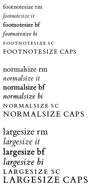
With the same structure, it's (repetitive) but easy to add a \footnotesize say, 8pt, and a \largesize at 12pt.

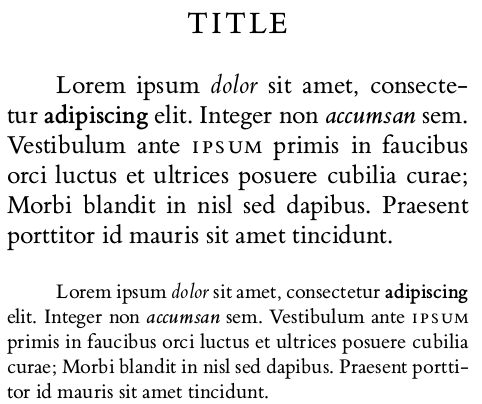
In regular writing the macros could work something like this:

\normalsize\rm % default for document

\centerline{\largesize\caps Title}

\vskip\baselineskip

Lorem ipsum {\it dolor} sit amet, consectetur {\bf adipiscing} elit. Integer non {\bi accumsan} sem. Vestibulum ante {\sc ipsum} primis in faucibus orci luctus et ultrices posuere cubilia curae; Morbi blandit in nisl sed dapibus. Praesent porttitor id mauris sit amet tincidunt.
 
\vskip\baselineskip 
 
{\footnotesize\rm
Lorem ipsum {\it dolor} sit amet, consectetur {\bf adipiscing} elit. Integer non {\bi accumsan} sem. Vestibulum ante {\sc ipsum} primis in faucibus orci luctus et ultrices posuere cubilia curae; Morbi blandit in nisl sed dapibus. Praesent porttitor id mauris sit amet tincidunt.\par
}

which gives:

This is a very primitive and simple way, and would probably become tedious if you're using lots of different fonts, then it would be better to use/make a more advanced system. There's a programming paradigm called "Worse is better", and I'm not sure if this is an example of that. Maybe it's just "Worse is worse". But, it's easy to understand all the moving parts, which can be a good thing.

The full code:

%\input luaotfload.sty
\input luafonts.tex

\hsize=65mm
\frenchspacing
\tolerance=1000

\font\eightrm "ETbb-Regular" at 8pt
\font\eightit "ETbb-Italic" at 8pt
\font\eightbf "ETbb-Bold" at 8pt
\font\eightbi "ETbb-BoldItalic" at 8pt
\font\eightsc "ETbb-Regular":+smcp;letterspace=10; at 8pt
\font\eightcaps "ETbb-Regular":+upper;letterspace=10; at 8pt

\font\tenrm "ETbb-Regular" at 10pt
\font\tenit "ETbb-Italic" at 10pt
\font\tenbf "ETbb-Bold" at 10pt
\font\tenbi "ETbb-BoldItalic" at 10pt
\font\tensc "ETbb-Regular":+smcp;letterspace=10; at 10pt
\font\tencaps "ETbb-Regular":+upper;letterspace=10; at 10pt

\font\twelverm "ETbb-Regular" at 12pt
\font\twelveit "ETbb-Italic" at 12pt
\font\twelvebf "ETbb-Bold" at 12pt
\font\twelvebi "ETbb-BoldItalic" at 12pt
\font\twelvesc "ETbb-Regular":+smcp;letterspace=10; at 12pt
\font\twelvecaps "ETbb-Regular":+upper;letterspace=10; at 12pt

\def\footnotesize{% 8pt
	\baselineskip=10pt
	\def\rm{\eightrm}%
	\def\it{\eightit}%
	\def\bf{\eightbf}%
	\def\bi{\eightbi}%
	\def\sc{\eightsc}%
	\def\caps{\eightcaps}%	
}

\def\normalsize{% 10pt
	\baselineskip=12pt
	\def\rm{\tenrm}%
	\def\it{\tenit}%
	\def\bf{\tenbf}%
	\def\bi{\tenbi}%
	\def\sc{\tensc}%
	\def\caps{\tencaps}%
}

\def\largesize{% 12pt
	\baselineskip=14pt
	\def\rm{\twelverm}%
	\def\it{\twelveit}%
	\def\bf{\twelvebf}%
	\def\bi{\twelvebi}%
	\def\sc{\twelvesc}%
	\def\caps{\twelvecaps}%
}

{\footnotesize\rm footnotesize rm}\par
{\footnotesize\it footnotesize it}\par
{\footnotesize\bf footnotesize bf}\par
{\footnotesize\bi footnotesize bi}\par
{\footnotesize\sc footnotesize sc}\par
{\footnotesize\caps footnotesize caps}\par

\vskip\baselineskip

{\normalsize\rm normalsize rm}\par
{\normalsize\it normalsize it}\par
{\normalsize\bf normalsize bf}\par
{\normalsize\bi normalsize bi}\par
{\normalsize\sc normalsize sc}\par
{\normalsize\caps normalsize caps}\par

\vskip\baselineskip

{\largesize\rm largesize rm}\par
{\largesize\it largesize it}\par
{\largesize\bf largesize bf}\par
{\largesize\bi largesize bi}\par
{\largesize\sc largesize sc}\par
{\largesize\caps largesize caps}\par

\vskip\baselineskip 
\hrule
\vskip\baselineskip

\normalsize\rm

\centerline{\largesize\caps Title}

\vskip\baselineskip

Lorem ipsum {\it dolor} sit amet, consectetur {\bf adipiscing} elit. Integer non {\bi accumsan} sem. Vestibulum ante {\sc ipsum} primis in faucibus orci luctus et ultrices posuere cubilia curae; Morbi blandit in nisl sed dapibus. Praesent porttitor id mauris sit amet tincidunt.
 
\vskip\baselineskip 
 
{\footnotesize\rm
Lorem ipsum {\it dolor} sit amet, consectetur {\bf adipiscing} elit. Integer non {\bi accumsan} sem. Vestibulum ante {\sc ipsum} primis in faucibus orci luctus et ultrices posuere cubilia curae; Morbi blandit in nisl sed dapibus. Praesent porttitor id mauris sit amet tincidunt.\par
}

\bye
5
2
submitted 1 year ago by estee to c/tex_typesetting

This is a rather interesting presentation by Jean-Luc Doumont about placing content on a grid, or a subset of the grid. He's kind of taking this idea to the extreme.

6
1
Controlling headers and footers (self.tex_typesetting)
submitted 1 year ago by estee to c/tex_typesetting

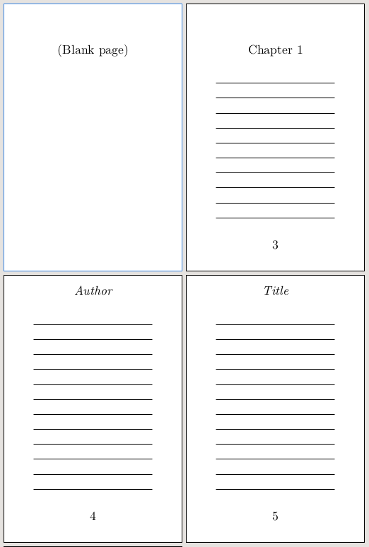
The defaults for headline and footline in plain.tex is:

\headline={\hfil}
\footline={\hss\tenrm\folio\hss}

I.e. there's no header, and in the footer the page number is printed in the center.

Many times I've found that some pages, like title pages or chapter opening pages, need exceptions from the defaults. I'd like to have a way of saying "on this page there should be neither header nor footer" or "on this page there should be a footer, but no header". Or, the header should say one thing if it's a verso page, and another if it's a recto page. In this case, we can use conditionals. They can be created like this:

\newif\iffootline \footlinetrue
\newif\ifheadline \headlinetrue

I want the default to be to print both headline and footline, so the conditionals are set to true initially.

In this case I want to control the current page only, so if the conditional is false, it needs to change back to true for the next page. For the footline, we could have this:

\footline{%
	\iffootline
		\hss\tenrm\folio\hss
	\else
		\hfil
		\global\footlinetrue	
	\fi
}

If the conditional is true, the footline is to be printed. If it's false, it prints nothing, but switches back the conditional to true for the next page.

We can do the same thing with the headline, but also add different headline texts if it's an odd or even page:

\headline{%
	\ifheadline
		\ifodd\pageno
			\hss\tenit Title\hss
		\else
			\hss\tenit Author\hss
		\fi
	\else
		\hfil
		\global\headlinetrue
	\fi
}

These conditionals can then be used in other macros, like for chapter headings, or used as they are by placing \headlinefalse and/or \footlinefalse on pages where you don't want headers and/or footers.

7
2
submitted 1 year ago* (last edited 1 year ago) by estee to c/tex_typesetting

It's been around... looks at clock ...nine years since something significant happened with the EB Garamond initials, but a couple of months ago they split off into their own github repo and you can now use all the letters of the alphabet! Before, it was limited to a subset of letters.

NB, this only applies to the original Duffner EB Garamond, not the Octavio Pardo version found on Google Fonts.

If you want them, clone or download the repo, download the dependencies, and run make. Or message me and I'll send the files. It's free software so that ought to be ok.

8
2
A macro to visualize boxes (self.tex_typesetting)
submitted 1 year ago by estee to c/tex_typesetting

There's this guy called Stephan V. Bechtolsheim who wrote a series of books on TeX called "TeX in Practice". He's really good at the finer details of, well, everything.

In one of the books, he makes a macro to visualize boxes. It's built up over many pages and chapters with lots of small macros as building blocks. Because he's reusing these macros in different places, it makes a lot of sense.

However, when I wanted to use the box visualizing macro, I found that I had to look up and copy a lot of code to make it work. This was no fun, so I re-wrote it in a "flatter" way where it's just regular plain old macros.

I ended up with this:

\newdimen\linethickness \linethickness=0.4pt

\def\boxlines #1{%
    \hbox{%
        % Save original (argument) box
        \setbox0 = #1%
        % Place bullet at baseline and vertical align of the box
        \setbox1 = \hbox{\hskip -2.5pt \lower 2.5pt \hbox{$\circ$}}%
        \ht1=0pt \dp1=0pt \wd1=0pt
        \box1
        % Place a dashed line at baseline
        \setbox2 = \hbox to \wd0{%
            \xleaders\hbox to 4pt{%
                \hskip 1pt
                \vrule depth 0.5\linethickness 
                	   height 0.5\linethickness 
                	   width 2pt
                \hfil
            }%
            \hfil
        }%
        \ht2=0pt \dp2=0pt \wd2=0pt 
        \box2
        % Place frame
        \setbox 3 = \hbox{%         
            \hskip -0.5\linethickness
            \vrule width \linethickness height \ht0 depth \dp0% 
            \hskip \wd0% 
            \hskip -\linethickness
            \vrule width \linethickness height \ht0 depth \dp0% 
            \hskip -\wd0% 
            \hskip -\linethickness
            \dimen0 = \wd0% 
            \advance\dimen0 by \linethickness
            \dimen2 = \ht0% 
            \advance\dimen2 by 0.5\linethickness
            \dimen4 = \ht0% 
            \advance\dimen4 by -0.5\linethickness
            \dimen4 = -\dimen4
            \vrule width \dimen0 height \dimen2 depth \dimen4
            \hskip -\dimen0
            \dimen2 = \dp0% 
            \advance\dimen2 by -0.5\linethickness
            \dimen2 = -\dimen2
            \dimen4 = \dp0% 
            \advance\dimen4 by 0.5\linethickness
            \vrule width \dimen0 height \dimen2 depth \dimen4
        }%
        \ht3=0pt \dp3=0pt \wd3=0pt 
        \box3
        % Place original argument box
        \box0
    }%
}

The macro takes a box as an argument, for example \boxlines{\box0}

It puts lines around the box, and marks out the baseline and the horizontal alignment. The neat thing is that the lines are made so that they don't interfere with the typesetting at all. Everything is placed as it would be without the lines.

If you have something that looks misaligned or strange, like these words:

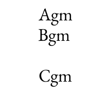
it can help to visualize the boxes:

9
1
submitted 1 year ago* (last edited 1 year ago) by estee to c/tex_typesetting

Sometimes it's nice to have a macro that prevents indentation of the next paragraph. For example, if you're writing your own section header macros and it's hard to automatically insert a \noindent in the right place. There's another way but it's not very intuitive:

\def\firstnoindent{%
    \global\everypar={%
        \global\everypar={}%
        \setbox0=\lastbox
    }%
}

When I first came across this I had to pause and think about it a little.

What happens when you start a new paragraph? First you're in vertical mode, then TeX interprets some tokens as horizontal material and wants to switch over to horizontal mode. \noindent is a special horizontal material that starts an empty horizontal list, but all other material, like regular characters or horizontal glue, will first insert an \hbox of \parindent length. This is your normal paragraph indentation. Next, TeX will insert the content of \everypar, and then come your words or whatever made TeX start a paragraph. This order is important. \hbox - \everypar - .

When you place \firstnoindent somewhere, it sets \everypar to contain two things. 1) An instruction to set \everypar to be empty. This makes sure that only the next paragraph is affected. 2) It sets \box0 to contain the last box created, which makes the last box disappear.

So this is now in \everypar, but it won't be expanded until a paragraph is created.

When the next paragraph is created, TeX inserted the indentation \hbox, then the content of \everypar, which wipes \everypar and does the other thing: \setbox0=\lastbox.

\lastbox is a primitive that removes the last box, then immediately inserts it again. By itself it changes nothing. The idea is that you can make it disappear as the input to a \setbox, do things to that box, then manually put it back with \box. But here we don't put it back, it just disappears. And the last created box was the indentation \hbox.

So, after putting \firstnoindent somewhere, we'll make the next indentation disappear, and the next paragraph after that \everypar will be empty, and will indent as usual.

Caveat 1: This assumes that \everypar is normally empty.

Caveat 2: I'm on my phone and haven't tested the code, but it should work, in theory, maybe.

10
5
submitted 1 year ago by estee to c/tex_typesetting

I've had projects where it's just one big .tex file including all the macros and content, and projects where there's a whole file hierarchy of chapter subdirectories and layers of \inputs and macro files and... It can sort of get out of hand for me, where it makes sense in the moment and then looking at it a week later it's a puzzling labyrinth of files.

I guess it depends on the nature of the project, but do you have a go-to way that works for you in most cases?

11
2
Initials/dropcaps/lettrines (self.tex_typesetting)
submitted 1 year ago by estee to c/tex_typesetting

There's an example of a dropcap in the TeXbook but it invokes \lineskip because of the big letter, and so makes it hard to stay on the grid. Another solution is to first skip down a few lines, place a big letter in a box of zero height, and then skip back up again and shape the paragraph with \parshape.

It could look something like this:

\font\tenrm "EBGaramond12-Regular" at 10pt \tenrm
\font\tensc "EBGaramond12-Regular":+smcp; at 10pt
\font\quotefont "EBGaramond12-Regular" at 23pt
\font\dropcapfont "EBGaramond12-Regular" at 46pt

Lorem ipsum dolor sit amet, consectetur adipiscing elit. Ut ut cursus ipsum, feugiat accumsan mi. Pellentesque sed ante ac augue tincidunt ultricies. Mauris vehicula ipsum est, nec bibendum odio semper sit amet. Aenean fringilla purus est, ut varius enim consectetur non.

\vskip2\baselineskip
\smash{%
    \hskip0pt % For moving the cap into the margin.
    \raise 15pt \llap{\quotefont “\hskip0pt}%
    {\dropcapfont N}%
}%
\vskip-3\baselineskip
\dimen0=35pt % First line indent
\dimen1=38pt % Second line indent
\dimen2=38pt % Third line indent
\parshape 4
    \dimen0 \dimexpr(\hsize-\dimen0)
    \dimen1 \dimexpr(\hsize-\dimen1)
    \dimen2 \dimexpr(\hsize-\dimen2)
    0pt \hsize
\noindent
{\tensc ullam,” auctor quam eget porta feugiat.} Suspendisse mattis fringilla turpis, vel hendrerit orci hendrerit nec. Donec vel nisi vestibulum, placerat leo in, tempus nisi. Sed non lacus id velit accumsan ullamcorper. Nulla eget risus ex. Pellentesque faucibus sit amet orci a fermentum. Quisque finibus turpis quis elit lobortis, sed viverra erat eleifend. Nulla imperdiet felis ac augue fermentum, in tincidunt nibh pellentesque.

If you have fancy dropcaps with foreground and background like in EB Garamond you can layer the caps with an \rlap to make something like this:

12
3
submitted 1 year ago* (last edited 1 year ago) by estee to c/tex_typesetting

As Knuths TeX had no support for colors or pictures, we have to make our own macros for that. The following macros are perhaps a bit simple, but that also means being easy to adapt to different needs and situations.

Images can be placed with an \image{} macro. It can be preceeded with \imageheight or \imagewidth to set dimensions. If a dimension is set to 0pt, the natural size of the image is used. This is very similar to how it's done in Opmac/OpTeX.

\newdimen\imagewidth \imagewidth=0pt % 0pt gives natural size of image
\newdimen\imageheight \imageheight=0pt
\newtoks\imagedir \imagedir{} % Must end with /, e.g. mypics/

\def\image#1{%
	\hbox{%
		\saveimageresource 
			\ifdim\imagewidth=0pt \else width\imagewidth\fi 
            \ifdim\imageheight=0pt \else height\imageheight\fi 
            {\the\imagedir#1}%
      	\useimageresource\lastsavedimageresourceindex
	}%
}

% Example: {\imageheight=4cm \image{mypicture.png}}

Colors can be set like this:


% Token for \aftergroup to reset color
\def\colorstackpop{\pdfextension colorstack 0 pop}

% Switch to CMYK color in current group. Expects four values between 0 and 1
\def\setcmykcolor#1{%
   	\pdfextension colorstack 0 push {#1 k #1 K}% 
   	\aftergroup\colorstackpop
}

% Switch to RGB color in current group. Expects three values between 0 and 1
\def\setrgbcolor#1{%
   	\pdfextension colorstack 0 push {#1 rg #1 RG}% 
   	\aftergroup\colorstackpop
}

% Color names
\def\black{\setcmykcolor{0 0 0 1}}
\def\blue{\setcmykcolor{1 1 0 0}}
\def\red{\setrgbcolor{0.8 0 0}}

% Example: {\blue This is blue text}
13
4
Two-sided documents (self.tex_typesetting)
submitted 1 year ago by estee to c/tex_typesetting

In a two-sided document, the margins are mirrored. This is good if the document is intended to be read as a book, where the combination of a verso and recto page is seen as a whole. Traditionally the inner margin is smaller, so that the white space in the middle (the combined inner margins) is in harmony with the outer margins.

If we first set the recto (odd) page with some margins, then we can figure out how much the type area on a verso (even) page needs to move.

Then, the idea is to insert an \hoffset-adjusting macro in the output routine before it does anything else.

In plain LuaTeX we could have this document:

% Undo 1 inch origin (personal preference)
\pdfvariable horigin 0pt
\pdfvariable vorigin 0pt

% A5 paper
\pagewidth=148.5mm
\pageheight=210mm

% Inner margin
\hoffset=0.111\pagewidth

% Top margin
\voffset=0.111\pageheight

% Type area width
\hsize=0.666\pagewidth

%Type area height
\vsize=\topskip
\advance\vsize by 32\baselineskip

\tolerance=9999 % Not important for testing

Then a spread would look like this:

Ok, so then we figure out how much a verso should move and insert that into the output routine:

% How much verso pages should move
\newdimen\shiftoffset
\shiftoffset = \pagewidth
\advance \shiftoffset by -\hsize
\advance \shiftoffset by -2\hoffset

% \hoffset-adjusting macro...
\def\beforeoutput{%
	\ifodd\pageno
	\else
		\advance \hoffset by \shiftoffset
	\fi
}

% ...inserted before the regular output routine
\output{\beforeoutput \plainoutput}

And then we get:

Caveat: if you have your coordinate origin somewhere else, like 1 inch in from the left and top, or some other setup, you may have to account for that in the macros.

14
8
submitted 1 year ago* (last edited 1 year ago) by estee to c/tex_typesetting

Jan Tschichold and Raul Rosariva independently researched the layout of medieval books, and each came up with a method of construction. Rosarivas version (to the right) lends itself very well to a programmatic approach. We could implement it (in luaTeX) in a few lines like this:

% Page size (proportions 2:3)
\pagewidth=150mm	
\pageheight=225mm

% Undo 1 inch origin (personal preference)
\pdfvariable horigin 0pt
\pdfvariable vorigin 0pt

% Inner margin
\hoffset=\pagewidth
\divide\hoffset by9

% Top margin
\voffset=\pageheight
\divide\voffset by9

% Type area width
\hsize=\pagewidth
\divide\hsize by9
\multiply\hsize by6

% Type area height
\vsize=\pageheight
\divide\vsize by9
\multiply\vsize by6

This is all well and good if we have vertically stretchable material on every page. But... if we want to do grid typesetting, we will quickly run into "Underfull \vbox (badness 10000)".

Let's say we've set \parskip=0pt.

\topskip=10pt and \baselineskip=12pt

\showthe\vsize produced "426.79129pt" in the log.

Right now we have 35 lines: \topskip + 34 \baselineskips, which is 10pt+(34*12pt) = 418pt, i.e. less than \vsize, but there's no room for adding another line.

Something has got to give.

One way is to define \vsize as a set number of lines, and then adjust \baselineskip to be slightly bigger to make \vsize be in accordance with the golden canon.

Either we stay with 35 lines and increase \baselineskip slightly, or we decrease \baselineskip to fit one more line. This is where you have to make a call based on what would make it better as a whole. In this case, I think it wouldn't hurt with a little extra leading, so I'll stick with 1+34 lines and go back and change \vsize:

\vsize=\topskip
\advance\vsize by 34\baselineskip

Now all that is left is to figure out how much to increase \baselineskip. We can leave \topskip as it is, at 10pt, so we're left with 426.79129pt - 10pt = 416.79129pt.

Divide that with 34 lines:

416.79129pt / 34 is approximately 12.2586pt, so we go back and set \baselineskip to that.

\baselineskip=12.2586pt

Now we have something like this (with added guidelines):

Finally, if our goal here is to make a type area rectangle of a certain proportion, it could be argued that the first line should have its x-height touch the upper border of the rectangle. The bulk of a line contributing to color is made up of the lower case letters. In that case we could adjust \voffset:

\advance\voffset by-\topskip
\advance\voffset by 1ex

but then we would also have to compensate the total \vsize and figure out a new \baselineskip.

Disclaimer: I haven't tested the above code, so there could be spelling errors etc, but it's more about the reasoning.

15
2
Modern versions of TeX (self.tex_typesetting)
submitted 1 year ago by estee to c/tex_typesetting

If you've read the TeXbook, you probably noticed that there are some outdated aspects of it. Most people don't use bitmap fonts or DVI anymore, they use opentype and PDF. Because of this, the engine evolved from TeX to pdfTeX, XeTeX and luaTeX. Two projects worth checking out if you are interested in a modern version of TeX, are:

OpTeX https://ctan.org/pkg/optex

Minim https://ctan.org/pkg/minim

16
3
The TeXbook (ctan.org)
submitted 1 year ago* (last edited 1 year ago) by estee to c/tex_typesetting

Donald Knuths surprisingly friendly manual of the TeX macro language.

Edit: Removed the link to the pdf, which is available online in various places, because of copyright. The source is freely available to read, but not to make your own document.

TeX typesetting

149 readers
1 users here now

A place to share ideas, resources, tips, and hacks for Donald Knuths typesetting software TeX. All variants and formats like OpTeX, LaTeX and ConTeXt are welcome.

founded 1 year ago
MODERATORS