26
Data is Beautiful
2366 readers
1 users here now
Be respectful
founded 1 year ago
MODERATORS

27
28
29
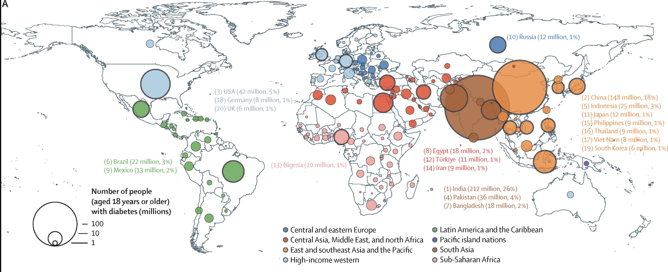
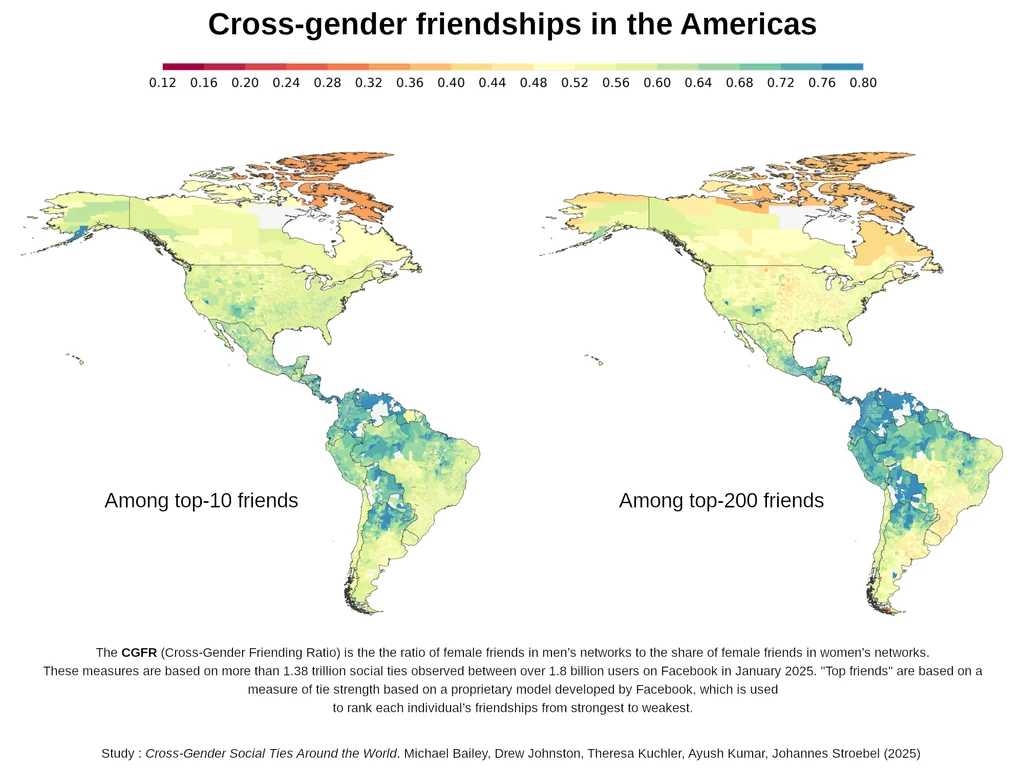
Some real beautiful data graphs in this paper
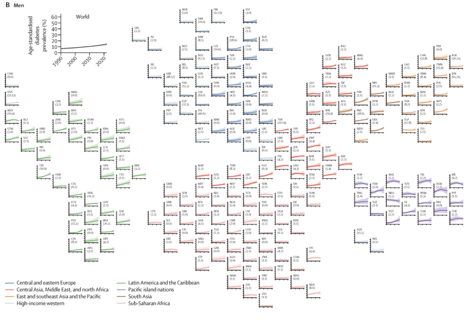
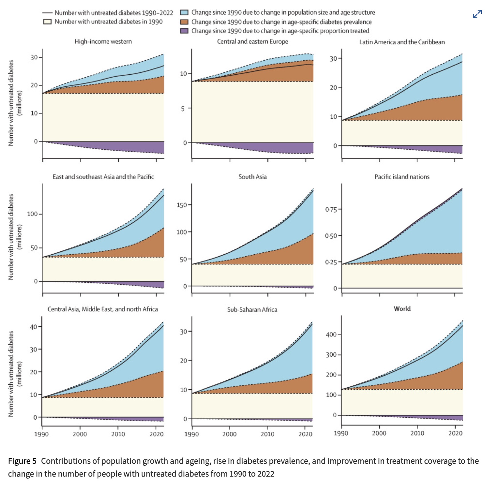
Source: https://doi.org/10.1016/S0140-6736(24)02317-1
The Top 4 Countries by rate:
- India 26%
- China 18%
- USA 5%
- Pakistan 4%
This is only accounting for tracked diabetes, so some of the areas might have larger numbers.
31
33
37
38
39

42
44
Cross posted from: Latin@lemm.ee
lingua latina pater linguarum dimidum est 😎
I hope it's okay for me to crosspost here.

46
There are 243,155 people in Canada that were recorded as being able to speak an Indigenous language in the 2021 census. This is 0.67% of the total population of Canada. However, this is still 100k more than the population with an Indigenous first language. Centuries of oppression have resulted in the decline of Indigenous languages in Canada, and revival efforts exist today among generations that did not grow up speaking the language.
The top 9 Indigenous languages in Canada are:
- Cree (an Algonquin language) with 87,875 speakers. Called a language, group of languages or a language continuum, most Cree speakers in Canada simply say they speak Cree.
- Inuktitut (an Inuktut language) with 41,680 speakers. The main language of the Inuit in Canada, and the only language other than English or French spoken by a majority in a province or territory.
- Ojibway (an Algonquin language) with 26,165 speakers. Similar to Cree, Ojibwe (or Ojibway in the census) has many dialects, though most identify with the language as a whole.
- Oji-Cree (an Algonquin language) with 15,305 speakers. Also called Severn Ojibwe, this is an "Ojibway-Potawotami language" language/dialect kept separate from the rest in the census.
- Dene (an Athabaskan language) with 11,555 speakers. Also called Denesuline or Chipewyan, spoken mostly in the northern half of Saskatchewan, it is arguably the top language there depending on how you measure Cree.
- Innu (an Algonquin language) with 10,745 speakers. The main language of the Innu of Northeastern Quebec and Labrador.
- Mi'kmaq (an Algonquin language) with 9,245 speakers. Mi'kmaq is an Eastern Algonquin language of the Maritime Provinces.
- Blackfoot (an Algonquin language) with 6,685 speakers.
- Atikamekw (an Algonquin language) with 6,815 speakers. In the Cree-Innu group, spoken mostly in the Saint-Maurice watershed north of Montreal.
Full stats can be explored in this table:
Note on "Insufficient Speakers". Stats Canada has an anonymity filter on all data that turns any response below 10 people to 0. So, in the top right map that means less than 10 speakers of an indigenous language. In the main map that means less than 10 speakers of an individual language family, and the unstriped Algonquin divisions have less than 10 speakers of one of the four individual subgroups.
Source: Census 2021, Knowledge of Languages by Census Division. Tools: QGIS, Excel

47

49
Here are the countries the US sells to
https://www.state.gov/fiscal-year-2023-u-s-arms-transfers-and-defense-trade/

50