Cool Guides
Rules for Posting Guides on Our Community
1. Defining a Guide Guides are comprehensive reference materials, how-tos, or comparison tables. A guide must be well-organized both in content and layout. Information should be easily accessible without unnecessary navigation. Guides can include flowcharts, step-by-step instructions, or visual references that compare different elements side by side.
2. Infographic Guidelines Infographics are permitted if they are educational and informative. They should aim to convey complex information visually and clearly. However, infographics that primarily serve as visual essays without structured guidance will be subject to removal.
3. Grey Area Moderators may use discretion when deciding to remove posts. If in doubt, message us or use downvotes for content you find inappropriate.
4. Source Attribution If you know the original source of a guide, share it in the comments to credit the creators.
5. Diverse Content To keep our community engaging, avoid saturating the feed with similar topics. Excessive posts on a single topic may be moderated to maintain diversity.
6. Verify in Comments Always check the comments for additional insights or corrections. Moderators rely on community expertise for accuracy.
Community Guidelines
-
Direct Image Links Only Only direct links to .png, .jpg, and .jpeg image formats are permitted.
-
Educational Infographics Only Infographics must aim to educate and inform with structured content. Purely narrative or non-informative infographics may be removed.
-
Serious Guides Only Nonserious or comedy-based guides will be removed.
-
No Harmful Content Guides promoting dangerous or harmful activities/materials will be removed. This includes content intended to cause harm to others.
By following these rules, we can maintain a diverse and informative community. If you have any questions or concerns, feel free to reach out to the moderators. Thank you for contributing responsibly!
view the rest of the comments

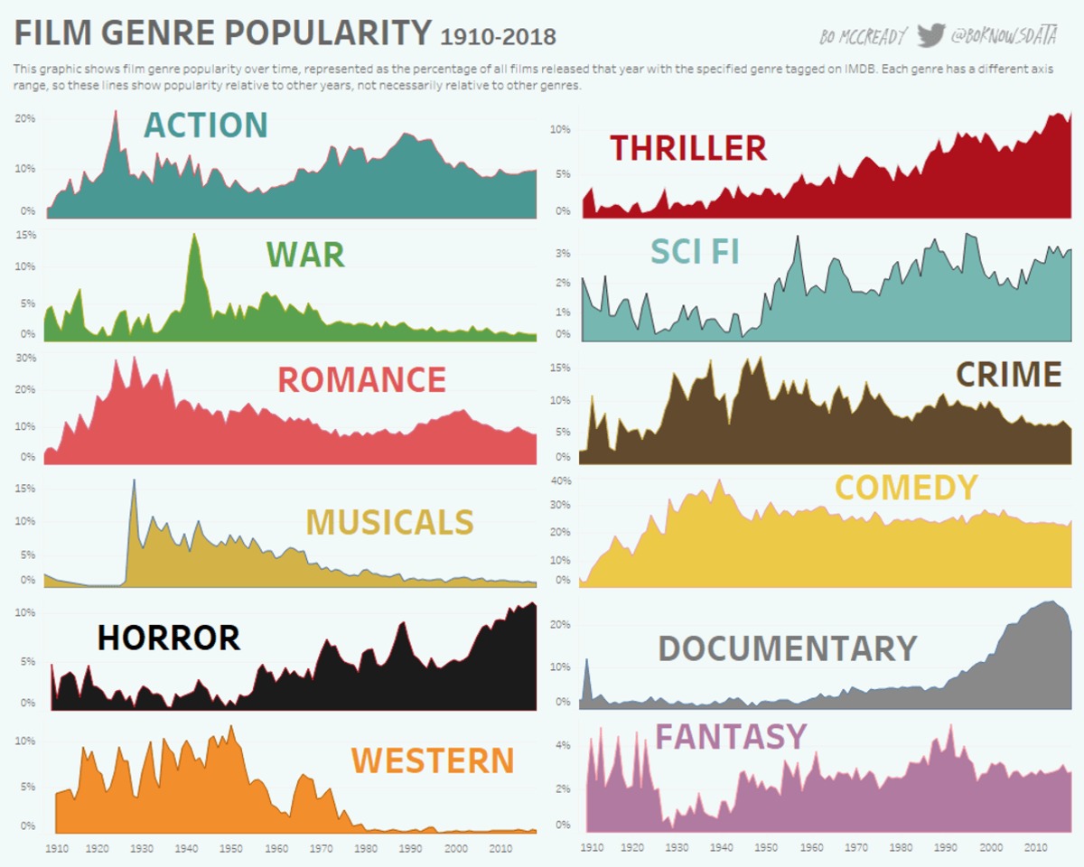
Cool but awful design, why is every graph in a different scale
So that you can compare the relative changes over the years without having a tiny line for less popular genres.
It actually tells you right below the title why they've chosen to do that
Depends on the goal of the visualization. This is an excellent choice if the goal is to show relative popularity changes over time, not absolute popularity relative to each other.
That said, the y-axes should be more prominent to draw readers' attention to the differing scales to decrease the chance this graph is misread.
It's also not explicitly stated that movies can be tagged with more than one genre, but, eyeballing the numbers, I'm pretty sure that must be the case.