308
Design Lead
(lemmy.ml)
Images of text-designs, that are barely readable due to the placement of the words or letters
Please indicate which post is original by writing "OC" and properly credit stolen posts.
Please mark NSFW posts properly, don't spam, yadadadada
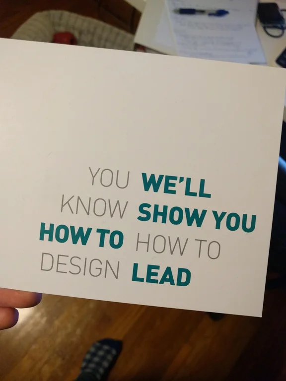
This is great design, the deliberately ambiguous text placement catches the eye of designers, who it's clearly targeting, and it's still plenty legible.
Is this the IRL version of "The easiest route to an answer to a question, is just to state something online"?
Risky. I didn't look at this and became compelled to go in person to correct them. Something unique about the online world that invites responses and correction.
The goal is to
invoke the impression that you are completely inept and fail at designing
???
profit.
I think the message (it's too explicit to call it an implication) is that the customers are designers, they know design better than the advertiser here, who is likely selling some sort of management class.
Yup. Cash in on that pity.