784
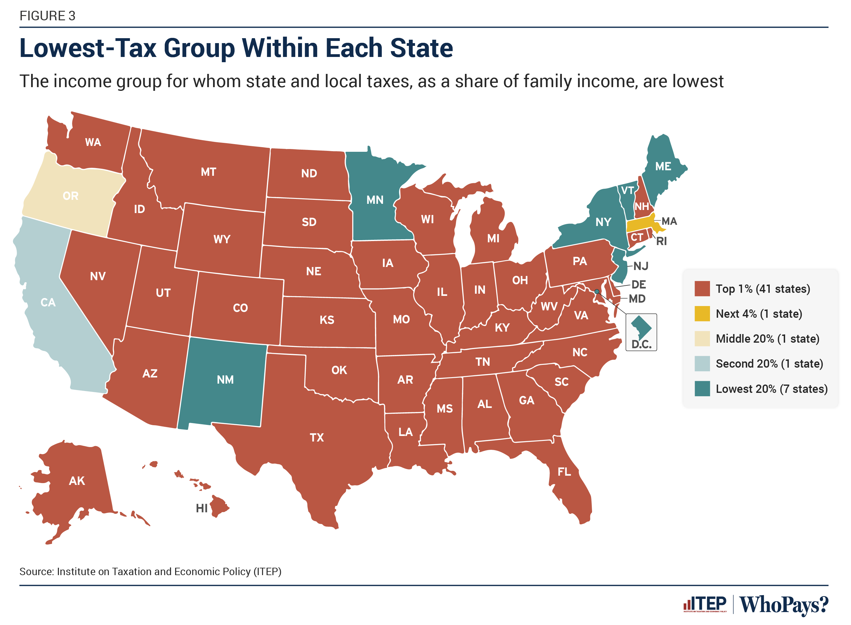
Lowest-taxed group in each state of the United States
(lemmy.world)
A place to share and discuss visual representations of data: Graphs, charts, maps, etc.
DataIsBeautiful is for visualizations that effectively convey information. Aesthetics are an important part of information visualization, but pretty pictures are not the sole aim of this subreddit.
A place to share and discuss visual representations of data: Graphs, charts, maps, etc.
  A post must be (or contain) a qualifying data visualization.

  Directly link to the original source article of the visualization
    Original source article doesn't mean the original source image. Link to the full page of the source article as a link-type submission.
    If you made the visualization yourself, tag it as [OC]

  [OC] posts must state the data source(s) and tool(s) used in the first top-level comment on their submission.

  DO NOT claim "[OC]" for diagrams that are not yours.

  All diagrams must have at least one computer generated element.

  No reposts of popular posts within 1 month.

  Post titles must describe the data plainly without using sensationalized headlines. Clickbait posts will be removed.

  Posts involving American Politics, or contentious topics in American media, are permissible only on Thursdays (ET).

  Posts involving Personal Data are permissible only on Mondays (ET).
Please read through our FAQ if you are new to posting on DataIsBeautiful. Commenting Rules
Don't be intentionally rude, ever.

Comments should be constructive and related to the visual presented. Special attention is given to root-level comments.

Short comments and low effort replies are automatically removed.

Hate Speech and dogwhistling are not tolerated and will result in an immediate ban.

Personal attacks and rabble-rousing will be removed.

Moderators reserve discretion when issuing bans for inappropriate comments. Bans are also subject to you forfeiting all of your comments in this community.
Originally r/DataisBeautiful
The ones with the absolute most, are, by and large, contributing the absolute least?
Ah but they're contributing in many other ways! Like, um... uh... let me think for a second...
Hmmm... I'm sure it'll come back to me eventually...
https://taxfoundation.org/data/all/federal/latest-federal-income-tax-data-2024/
I hate to be that guy but the top 5% pays nearly 50% of all income taxes paid.
Don't get me wrong the system is broken.
And the top 10% owns 67% of all the wealth (I'm not seeing an option to show just the top 5%). Considering how many millions and billions of dollars they all own, it only makes sense that they're also paying the most. Especially since they can easily afford it without lowering their standard of living.
Absolutely agreed they can afford it. I just don't like having disingenuous data presented. The % shown makes it look like they're not paying as much taxes as the rest of us. The reality is they pay the most. We shouldn't have to stoop to creating fuzzy charts, we don't need to because the other numbers are even worse, as you have shown. They own 67% of all the wealth, which is insane.
The graph is showing who pays the least as a percentage of family income. I really don't think it's disingenuous to be talking about tax rates as percentages rather than the total amounts paid.
That's because proportionally, they are paying less. Millionaires and billionaires are paying taxes at a lower rate then everyone else, even though they have so much more disposable income.
I don't know what your ideal version of talking about this would be, but these three facts, that the top 1% pay the least proportionally, the top 5% pay the most in absolute terms, and the top 10% control two thirds of all the wealth, are all related in a pretty basic way.
The difference between fighting disingenuous data and reframing the issue to favor another party is the degree in which the so-called disingenuous aspect actually matters.
In this case, the fact that the top 4% pay materially more than the rest doesn't actually matter because they own the vast majority of the wealth. If that same wealth were evenly distributed, more of it would be paid into the system. And that is the point.
What you are doing is not representing the other side of a disingenuous issue, what you are doing is framing the issue in a way that favors the wealthy by citing a statistic that is beside the point.
That in itself is dishonest and a talking point that the wealthy use regularly to try and convince people that they are actually the good guys.
Top 5% if AGI. These numbers are based on Adjusted Gross Income. That vastly inflates the portion the truly wealthy pay compared to their wealth. They get to use the stock they own and open lines of credit for cash, then pay down those loans while using them to write off for the little stock they sold. These sort of tricks are why Bezos didn't pay income tax for two years
https://www.businessinsider.com/jeff-bezos-did-not-pay-income-taxes-2-years-report-2021-6?op=1
I appreciate your desire for accuracy, but the context is lacking.
Thank you for adding the always missing nuance. But other readers don't get it twisted; parsing the financials of those too wealthy for mere cash liquidity isn't simple by design. The context is always obscured in Economics because abstraction makes the bills we all pay on their behalf.
They're contributing more, but less of their percentage. Like 20% of $40,000 is less than 10% of $700,000,000.
It's bullshit. Percentage needs to increase with what you make. It will curb inflation and stop the ridiculous wealth disparity from increasing at an ever expanding rate. All the boomers were doing so great in the 1950's because the wealthy had the shit taxed out of them.
What's fucked is that when you have more, you can afford to lose a higher percentage of it. Like Chris Rock said, "if you're worth $30 million and you lose half, you're probably going to be alright. When you're worth $30 thousand and you lose half, somebody's gonna have to die!".
I am in a high income tax group here in Germany. I am happy to pay almost half of my income in taxes and social security/health insurance, if I see that it gets well invested. We are a society and the stronger should always carry the weaker (both financially and also in other aspects).
BUT: I am really pissed that I have to pay such a high percentage of what I have to work hard for, while those who did nothing but being born into a rich family pay hardly anyything at all. High income taxes should only be a thing when wealth taxes are also high, otherwise it only kills the will to work hard.
I definitely lean more towards a capital gains tax over an income tax. People should be rewarded for what they did this week rather than what their grandfather did forty years ago.
However, I am biased since effectively every cent I have comes from income. So maybe take what I say with a grain of salt.
In percentage yes.
Its just an incredibly misleading statistic. The thing that is missing is that the richest pay more in capital gains not income tax, and this is all state and local so things like property tax and sales tax have a much higher impact on people making less.