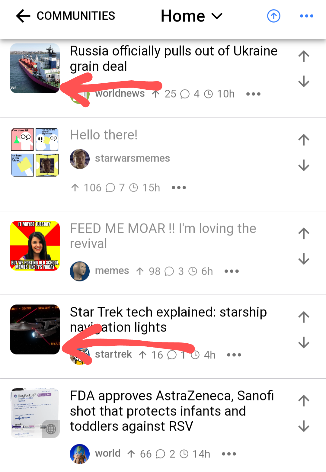
this post was submitted on 18 Jul 2023
46 points (97.9% liked)
Voyager
6785 readers
38 users here now
The official lemmy community for Voyager, an open source, mobile-first client for lemmy.
Rules
- Be nice.
- lemmy.world instance policy
Sponsor development! 👇
💙
founded 2 years ago
MODERATORS
you are viewing a single comment's thread
view the rest of the comments
view the rest of the comments


Yeah, a confirmation pop-up (or at least the option for one) when you tap on a link would go a long way to helping with that.