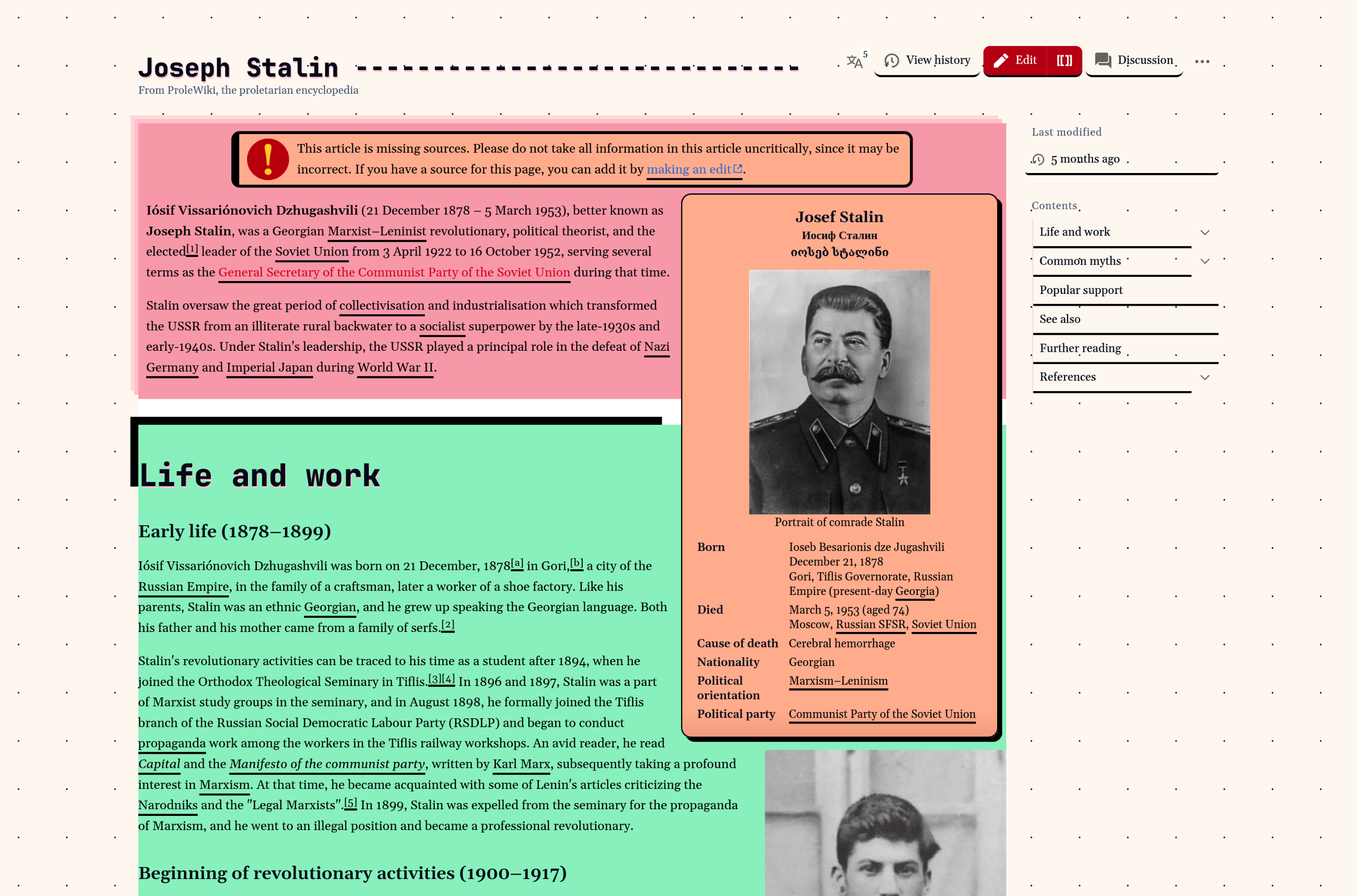
I don't like the thick upside down L shaped black border. Otherwise it's fine. But is the change really necessary? Does it help with readability or does it hinder?
Seems as if it's suppose to be a shadow of the text box, look at the other text boxes. Guess they accidently fumbled that box shadow, and it just cut off.
It's pretty cool regardless, and a good visual interface can certainly help engagement and reading.
I don't like the thick upside down L shaped black border. Otherwise it's fine. But is the change really necessary? Does it help with readability or does it hinder?
It uhh does things to one's brain and that's about it
I wouldn't be able to read from it. Maybe it could be an option?
Seems as if it's suppose to be a shadow of the text box, look at the other text boxes. Guess they accidently fumbled that box shadow, and it just cut off. It's pretty cool regardless, and a good visual interface can certainly help engagement and reading.