56
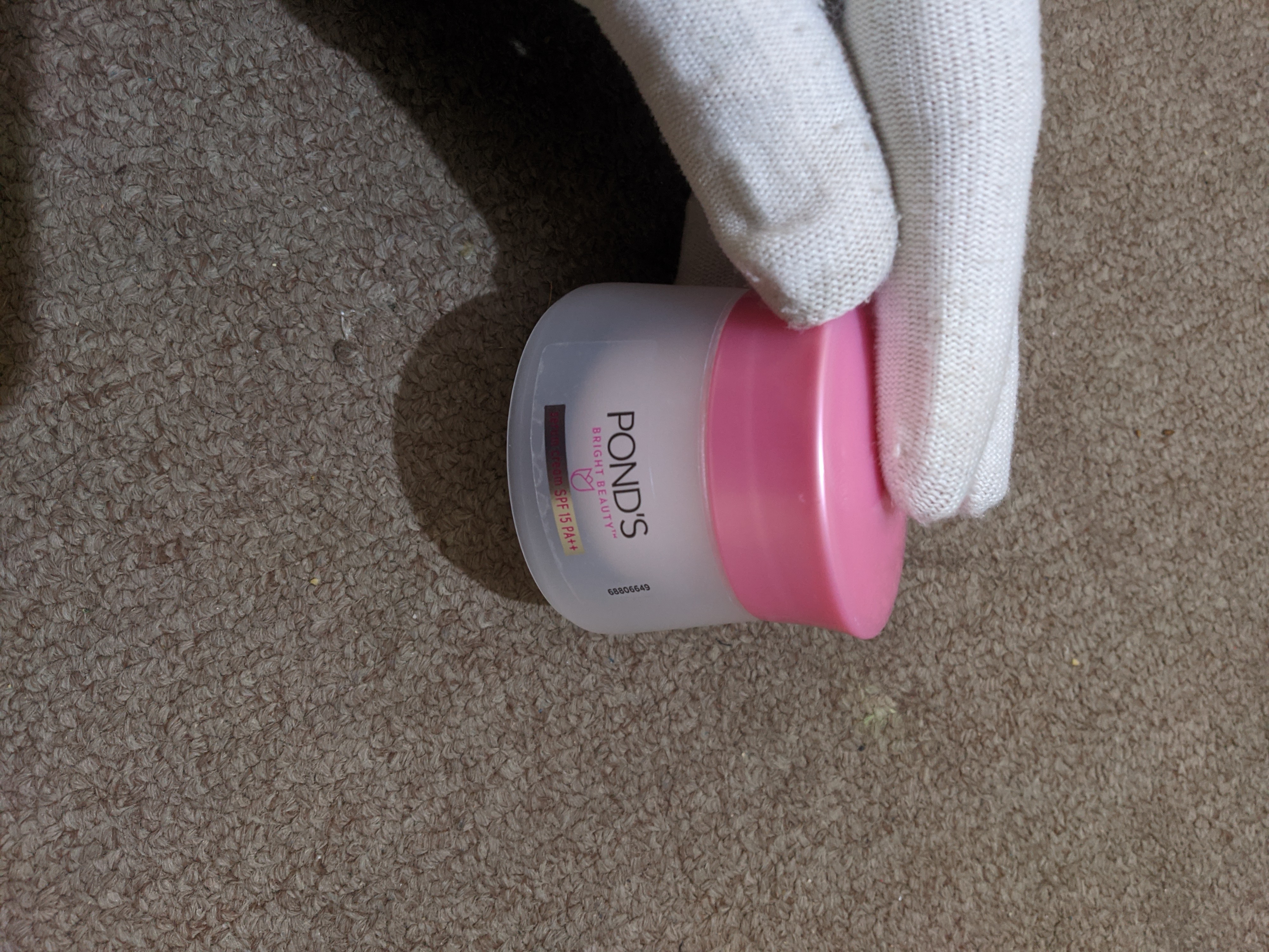
this moisturising cream
(discuss.tchncs.de)
This is a community for designs specifically crafted to make the experience worse for the user. This can be due to greed, apathy, laziness or just downright scumbaggery.
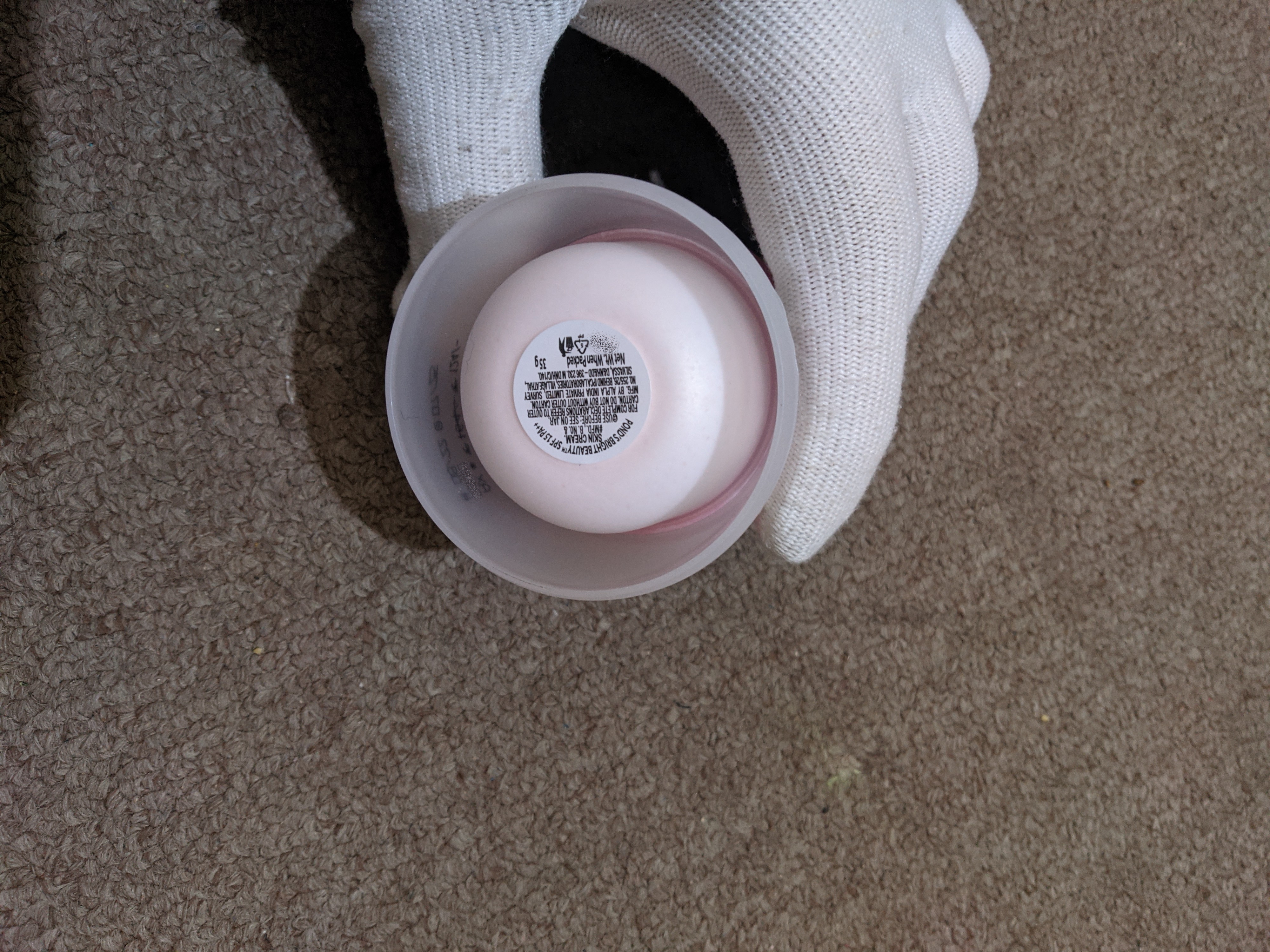
Dont really see how this is asshole design, from the front its visible where the cream is in the jar?. When buying and lifting it, volume or weight is visible and you can turn it over to check. Nothing was hidden.
but as the cream came in a cardboard box, I couldn't have guessed that it'd be so small.
And when you bought it, did you look at the description, or did you just look at the picture and assume it was bigger?
Generally these things have the weight of useable material listed in the description or listed on the container somewhere like the back which would normally be in one of the pictures of the item.
Unless there's absolutely no mention of the amount of product in the container this really isn't asshole design.
Then the design of the bottle couldnt have an influence on your purchase decision either.
yes it could have, the increased bottle size would require a larger box
If this design really isn't asshole design, then why are they still doing it like this? It's pretty obviously supposed to look like it has more content than it does rn; and even if you do realize what's going on, this makes it way harder to guess the amount of the contents. A number for gram amount is ok, but your brain really guesses by looking at the content, not the number.
I once bought a tube of food grade sealant that looked like an effervescent aspirin/vitamin tube: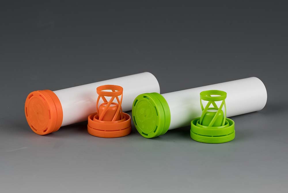
Turns out it was several times larger, that was even stated in the volume specs, but you're right, one does guesstimate based on a picture first.