this post was submitted on 28 Aug 2023
1318 points (91.4% liked)
Memes
54734 readers
2643 users here now
Rules:
- Be civil and nice.
- Try not to excessively repost, as a rule of thumb, wait at least 2 months to do it if you have to.
founded 6 years ago
MODERATORS
you are viewing a single comment's thread
view the rest of the comments
view the rest of the comments

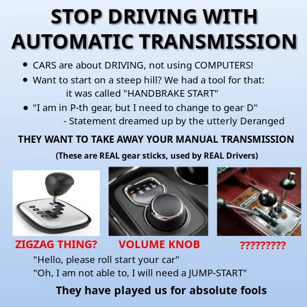
Those piss me off for reasons beyond manual supremacy - they're bad UI design too. A knob is for controlling something (like volume) which varies continuously over a range. It is not for selecting from a short list of discrete options!
Ah, gotcha! We need a menu inside the entertainment system where you can select a gear via touch-screen... /s
Please stop giving them ideas
yep.