this post was submitted on 19 Oct 2023
569 points (100.0% liked)
196
17544 readers
623 users here now
Be sure to follow the rule before you head out.
Rule: You must post before you leave.
Other rules
Behavior rules:
- No bigotry (transphobia, racism, etc…)
- No genocide denial
- No support for authoritarian behaviour (incl. Tankies)
- No namecalling
- Accounts from lemmygrad.ml, threads.net, or hexbear.net are held to higher standards
- Other things seen as cleary bad
Posting rules:
- No AI generated content (DALL-E etc…)
- No advertisements
- No gore / violence
- Mutual aid posts are not allowed
NSFW: NSFW content is permitted but it must be tagged and have content warnings. Anything that doesn't adhere to this will be removed. Content warnings should be added like: [penis], [explicit description of sex]. Non-sexualized breasts of any gender are not considered inappropriate and therefore do not need to be blurred/tagged.
If you have any questions, feel free to contact us on our matrix channel or email.
Other 196's:
founded 2 years ago
MODERATORS
you are viewing a single comment's thread
view the rest of the comments
view the rest of the comments
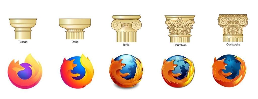
I know I'm completely butchering the color palette here, but I've finally realized what I felt was missing from the new logo. In the previous iterations, the head was always turned in such a way that you couldn't see the eyes. Now the head is at an angle where you should see the right eye. But you don't, the head is completely empty.
Here's an """"improvement"""" making the logo a bit more friendly I think:
Now it looks like it has a mole lol