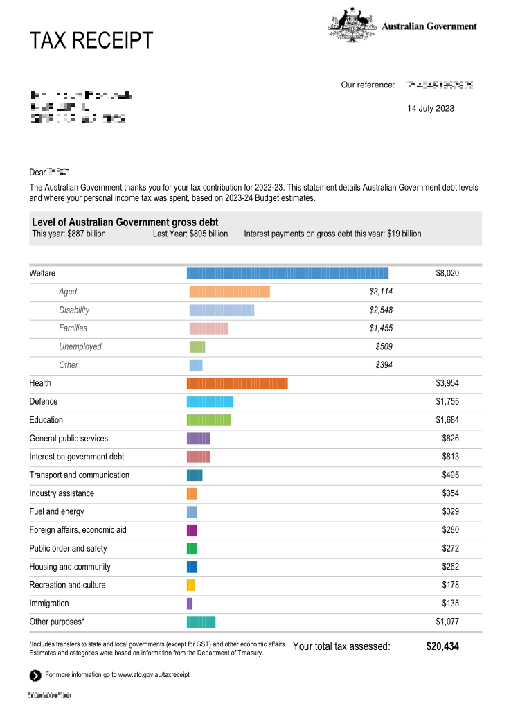
I love that it helps you see how little of the welfare payments are going to the unemployed, since that’s the part that concerns people the most.
Mildly Interesting
This is for strictly mildly interesting material. If it's too interesting, it doesn't belong. If it's not interesting, it doesn't belong.
This is obviously an objective criteria, so the mods are always right. Or maybe mildly right? Ahh.. what do we know?
Just post some stuff and don't spam.
That’s a newer addition, when it first came out under a conservative Goverment, all welfare was grouped together.
Classic Conservative tactic.
"Evil, stupid, greedy-" stuffs pockets "-jobless, welfare scroungers!" stuffs pockets "Pensioners, vote for me to bring down our welfare spending!"
Indeed, especially since I am quite unconcerned about the Aged. They had their chance!
Uk government tried this a few yrs ago trying to spin the welfare part as work shy bambots then it came out that the lions share was pension pots that took up most of it with the teachers pensions being the one the media focused on
Always liked this because it helps people see to some extent where money is going.
I know the UK and Portugal do this as well. It was especially interesting in the UK during the Brexit years because you could see a tiny piece of that pie chart with EU contributions, almost saying "this is how little of our money is going to Europe", didn't do any good in the end but hey, still great info to have that all detailed
the UK do this as well
They do?
Well shit, they do! Shame they don't actually tell you about it actively - as you said, they probably don't want most people to realise.
It must be so nice to see such a small bar for your defense spending.
It's still 8.6%, that's quite a lot actually...
One thing to note about this breakdown is that it wasn't legislated with good intention but it was implemented in a very malicious compliance way that completely counteracted the original intention.
This receipt was legislated by the conservative party in Australia under Tony Abbott, the surface level intention was to "show where people's tax dollars are spent". However the underlying intention was to show welfare spending as a huge category that totally eclipsed all other spending in order to demonize welfare, particularly unemployment welfare. In order to build public support for rolling back that spending.
However when the letter was implemented, the welfare category was further broken down as you see here, completely working against the narrative that the government at the time was trying to spin (that unemployment welfare particularly was a huge drain on society).
Instead it shows that boomers are the real drain on society
In the US that would be a list of Congressmen and the Billionaires who own them.
Eww you guys are getting close to spending more on education than the military. Slippery slope.
This is pretty great. This should be happening everywhere.
I get one from the US gov. It looks like:
Military spending ======================== Other =
Another thing that's great about aussie tax.. you can fill it out yourself, it's very easy, all online, and it takes a very short time. They also explain every question in the form and have lots of materials that you can read. For me, I finish it each year in about 10 minutes, and never think about it again.
That's slightly more than mildly interesting
I think something like this would make U.S. citizens feel better about taxes in general, since it can sometimes feel like you're throwing a large portion of your hard-earned money away.
The data to create this is essentially public with budget bills right? It would just take building a percentage tree and categorizing them appropriately. I might look into how complex this would be to build.
The US doesn't give you a nice little letter, but you can go to https://usafacts.org/visualizations/the-big-picture/ to see something similar.
In America, our government organizations can't pass an audit
Most can. The DoD has consistently failed for years. Yet we still keep ballooning their budget.
Fun fact: in the United States you can request this same sort of receipt. It's slightly different, but all you have to do is request it, and they can show you exactly how many brown people they shot, or godless communists they've brought democracy to with your taxes!
It must be nice to live in a country where accountability is at least attempted. This shit would never work in Murica bc welll…. corruption.
USA:
Defense: |||||||| |||||||| |||||||| |||||||| |||||||| |||||||| ||||||||
Boomer Welfare: |||||||| |||||||| |||||||| |||||||| ||||||||
Interest on Debt: |||||||| ||||||||
Everything Else: |
Where is the 1 trillion on defense? /s
W government. We need this level of transparency from all governments.
That is very interesting.
So what they do is take your tax and apportion it over by the Expense and Net Captial Investment Statement in Budget Paper 1 (usually Statement 6).
It's dead simple to do and really helps communicate where your money is going in general terms.
It was a Joe Hockey initiative.
Kinda wish we got this in the US. Then people will realize all the junk our taxes support and will also (likely) want to cut spending.
Only in a perfect world
You can request this in most countries, especially here in Canada. It's cool that the Aussie government makes it more transparent and accessible though. The "other purposes" seems a bit sussy-baka, though.
I think this is a pretty good idea, actually. While this kind of information is available in most western places, people usually can't be bothered to look it up and then have very weird ideas about what their taxes are probably spent on. This would at least help clear some things up.
