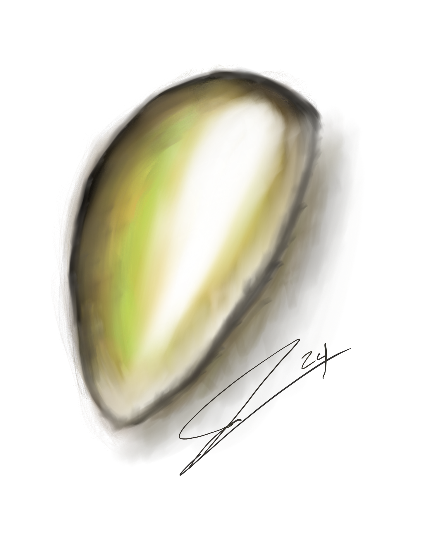
It looks like a peeled garlic clove
Art Share🎨
This is a friendly community for everyone who wants to share their art with the world! Everyone is welcomed 🎨
Please visit https://lemmy.world/c/artmarket as well! This is a community for artists to post their portfolios and announce availability to take commissions, as well as get visibility for Ko-fi, Patreon, and other funding for art activities.
Rules
AI Art: While we appreciate AI generated art, there are more appropriate communities to post that type of art to. Please keep posts to non-AI generated art only. This rule includes AI art that was then manually manipulated (e.g. drawing on top of something generated by AI).
Nudity: Nudity is and has always been a part of art, but it may be something that some users don't wish to see or cannot view in certain circumstances (e.g. at work). If your work contains nudity, please mark it as NSFW. Work that contains nudity that is not marked as NSFW will be taken down. As long as the NSFW tag is used, we welcome nude subject matter.
Spam: Please do not spam this community. Self promotion is fine if you just want people to be aware of your work, but blatant attempts at spam will result in the past being removed and possibly a ban. If you aren't sure if what you are posting is spam, please contact the moderator first.
Conduct: Be nice, and don't be a jerk. Constructive criticism is OK, but don't be mean. Encouragement is always welcomed.
Depending on what app you used, you can make it more authentic and traditional-looking by adding a paper texture layer underneath and setting the blend mode to overlay or multiply.
I'll give that a go.
I really like the tones and blending! Only critique I can think of for this particular style, is that the outline feels a bit too dominant, especially on the side of the shadow. What I would try there would be either (a) blending the outline into the shadow, so it is one shape instead of the subject + shadow divided by a line, (b) use a color for the line that is closer to the hue of the subject, rather than mostly gray/black or (c) experiment with line weight a bit. Just some thoughts, I hope it makes sense :)
Thank you!!
If you want a more traditional look, I guess that you mean like a realistic painting, then it is too dark and light IMO, the value (which is more important than hue BTW) goes all the way from black to white.
The hue (or "color") seems to be chosen more for style than for representing a real nut/fruit, in nature usually nothing is very saturated, it's quite dull! So try out some dull brown colours and try to make what you can with them. That's what you do when painting, maybe you can try it out digitally.
As you are doing digital, you can check out values by switching your painting to black & white (just removing the saturation doesn't work well).
I'd put in a background too, could be a dull color, but that's just me :-)
Good luck!
Thank you!!
