142

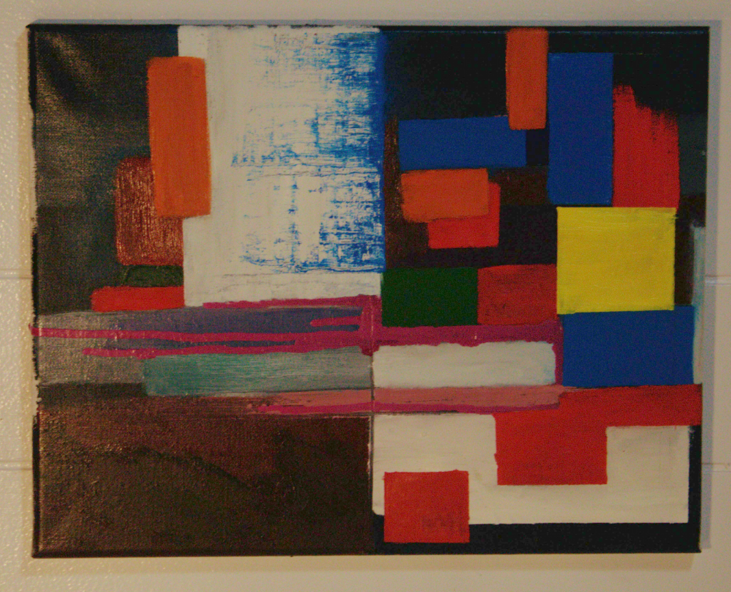
That image got really dark when I uploaded it, here's a screenshot of it for better colors

That image got really dark when I uploaded it, here's a screenshot of it for better colors
Looks much better
I am a enjoyer of art but no critic. I very much like this style and I think you are well in your way. For me I actually preferred the image more when it was darker. I liked that the vibrancy was toned down and made me want to look closer and see the brush work and made me want to sit and stare and think. Great first outing.
Hahaha I made my post before I saw this.
I'm not knowledge enough of the style to provide meaningful feedback. So take everything I say with a massive grain of salt.
I think it's generally lovely and interesting to look at.
It feels a little top-heavy to me, though it's not necessarily bad if it's intentional. I think the yellow square heavily draws the eye and weights the space.
The dripping paint is a really interesting counterpoint, but it's so gentle my eye tends to be drawn upward again, leaving the bottom right hand corner largely unexplored.
I think the use of texture is really good and creates interesting contrast that keeps me engaged with the piece.
As a first-time critic of the style to a first-time artist of the same, I think it's really good and if you have the time and resources would benefit from exploring it further.
That's a frank, honest, and rather helpful critique. At this stage of exploration here, much more could be discouraging, so that's great!
To OP: The whole piece is a confident result of hours in this style, and clear focus on a few key elements of it. Keep working on those and try out new concepts within the style as you progress. Have fun, and keep up the good work! 🤌🏼
I genuinely appreciate the critique critique. I was aiming for authentic, encouraging feedback from a layperson perspective.
Art is so funny.
For me. The yellow square is "unremarkable". I keep staring at the drips and love how the solid blocks are framing it. I wouldn't change anything about this painting. It is lovely.
So I'm guessing you're going for a color field painting, like Mark Rothko or Piet Mondrian style yeah? If so, great job! You've captured this style very well. In my personal opinion, the 'weight' of the top half of the painting is a bit heavy or busy versus the bottom half. I would suggest turning the painting sideways or upside down and seeing if you like it.
So maybe like this:
Or like this:

Holy crap you're right. I like it better in both of those orientations. Art is crazy because you can spend hours every day painting something before someone makes you realize you've been holding it upside down the whole time
This is actually very cool. It has quite a different vibe depending on orientation. The first alternate orientation feels much more grounded.
I guess I shouldn't be surprised. Good photographers also use composition techniques like this all the time, for example.
I really like it upside down. I feel like it grounds the painting. It's a very elegant suggestion
Honestly my only complaint is the picture is too damn dark. I fucking love this!
I feel like you may only be able to receive meaningful feedback if you mention your goals for the piece.
Cool! You missed a spot on the bottom left. Love it!
From dabblers to masters, obscure to popular and ancient to futuristic, this is an inclusive community dedicated to showcasing all types of art by all kinds of artists, as long as they're made in a traditional medium
'Traditional' here means 'Physical', as in artworks which are NON-DIGITAL in nature.
What's allowed: Acrylic, Pastel, Encaustic, Gouache, Oil and Watercolor Paintings; Ink Illustrations; Manga Panels; Pencil and Charcoal sketches; Collages; Etchings; Lithographs; Wood Prints; Pottery; Ceramics; Metal, Wire and paper sculptures; Tapestry; weaving; Qulting; Wood carvings, Armor Crafting and more.
What's not allowed: Digital art (anything made with Photoshop, Clip Studio Paint, Krita, Blender, GIMP or other art programs) or AI art (anything made with Stable Diffusion, Midjourney or other models)
make sure to check the rules stickied to the top of the community before posting.
