3DPrinting
3DPrinting is a place where makers of all skill levels and walks of life can learn about and discuss 3D printing and development of 3D printed parts and devices.
The r/functionalprint community is now located at: or !functionalprint@fedia.io
There are CAD communities available at: !cad@lemmy.world or !freecad@lemmy.ml
Rules
-
No bigotry - including racism, sexism, ableism, homophobia, transphobia, or xenophobia. Code of Conduct.
-
Be respectful, especially when disagreeing. Everyone should feel welcome here.
-
No porn (NSFW prints are acceptable but must be marked NSFW)
-
No Ads / Spamming / Guerrilla Marketing
-
Do not create links to reddit
-
If you see an issue please flag it
-
No guns
-
No injury gore posts
If you need an easy way to host pictures, https://catbox.moe/ may be an option. Be ethical about what you post and donate if you are able or use this a lot. It is just an individual hosting content, not a company. The image embedding syntax for Lemmy is 
Moderation policy: Light, mostly invisible
view the rest of the comments

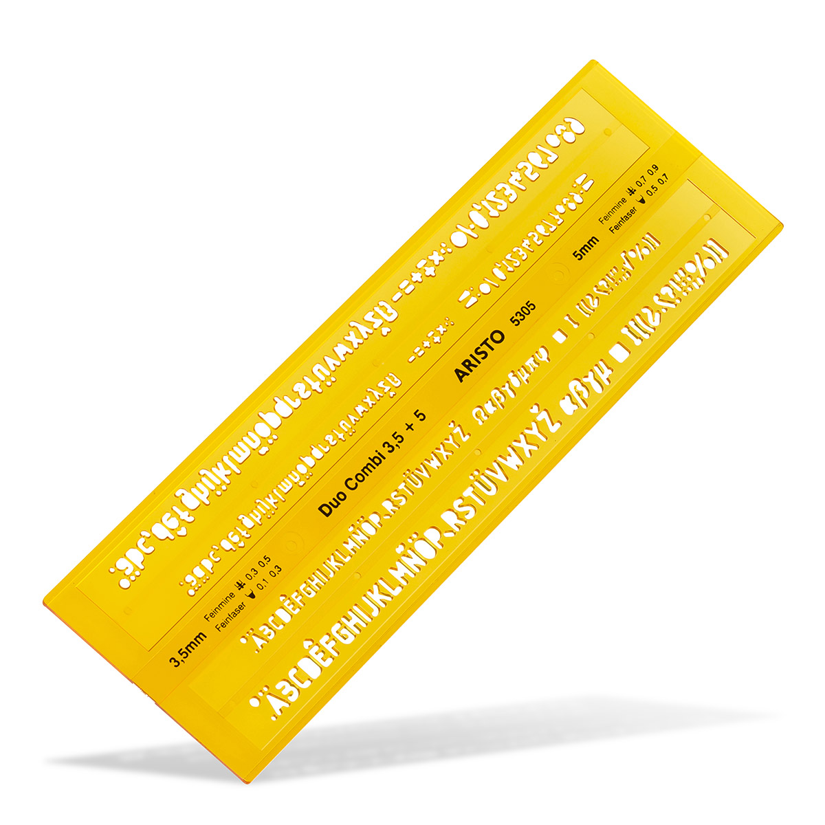
No idea where to find such a font. But why not just do it yourself? Find a font you like, make the 3D file, and then add the positive bars to support the loose bits manually to each character that needs it.
I'm assuming that you don't have hundreds of such cases for your stencil, of course.
Well, there are plenty of fonts available with these sorts of bars attached that can be printed this way. For example, I saved this font for another project. However, looking at it in the 3D render, the font seems too fragmented at this scale. Another option might be this one. But they both don't fit the aesthetic I would like to have.
Yes, creating my own font is also viable, but I would prefer to not dig into another branch of creative work, as I tend to start too many projects at once, anyway.
That is a very healthy attitude to have!
He's not talking about designing your own font. He is proposing to use the font you like and just to create this little "bridge" that you need so that the inside of the o is not falling out manually. That is easy to do and there are not that many letters where it is needed.