Here are some proposed graphics.

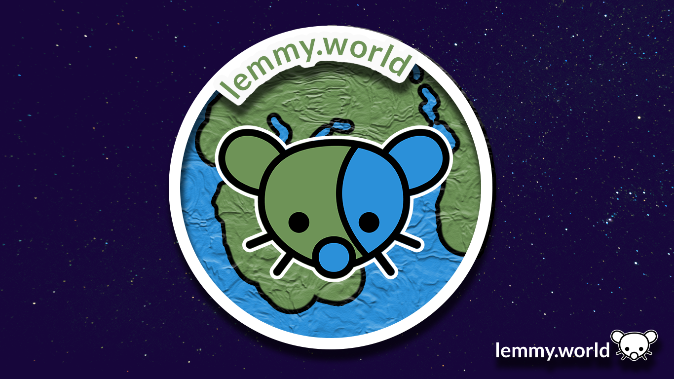


EDIT: I've now made a repository on GitHub, so that you can download the graphics and use them for your communities and projects. There's even an Etsy store selling stickers now.

Welcome to the official Lemmy.world Support community! Post your issues or questions about Lemmy.world here.
This community is for issues related to the Lemmy World instance only. For Lemmy software requests or bug reports, please go to the Lemmy github page.
This community is subject to the rules defined here for lemmy.world.
To open a support ticket
You can also DM https://lemmy.world/u/lwreport or email report@lemmy.world (PGP Supported) if you need to reach our directly to the admin team.

Here are some proposed graphics.
EDIT: I've now made a repository on GitHub, so that you can download the graphics and use them for your communities and projects. There's even an Etsy store selling stickers now.
You: Which one do you like?
Me: Yes.
I made this 16x16 favicon (CC0 license)

Oh, what a wonderful addition! That's a cutey if I've ever seen one @p1mrx@lemmy.world!
Are you working with the site admins to include this? It will require scaling the png to 25% size, and a line of HTML:
<link rel="icon" type="image/png" href="whatever.png" sizes="16x16">
I love it
As a bit of a post script, I also made graphics for the Mastodon.world instance. So if these look familiar, well, it's because they are familiar! Thank you have having me here, Ruud, and to the whole Administrator team!
website seems to be down
Oh dear. That's concerning. I'm... going to go check on my hosting.
The first is by far the best. A logo is not a name tag. You don’t need to have lemmy.world written in it.
Both 1 & 2 look better on a web browser but on mobile the globe has a weird texture look to it. I like #1 as a banner and #5 for the icon. I will say I also like the current icon.
Am I the idiot or is it really a penis next to its right cheek on the images with the globe? Maybe both.
Oh dear. Now that you mention it, I kinda see it too. Thanks for the flag: I'm... going to give it a think about how to shift it so that... isn't there. Maybe in the second version.
Dont really like any of them. They are to busy for no real benefit. The logos are not unique enough that you would instantly recognize them. Because they are not better than the current generic earth picture I say we just leave it.
Try making the left ear blue and the right one green.
Yeah, otherwise the lemming's face is camouflaged.
The bottom ones. Remind me of Braveheart 😃

"They may take our third party apps..."
Very cool!
Does lemmy have polls? It could be useful to see which one people like the most
I like the 3rd one as it looks like a lemmy world in space and doesn't get muddled by a background. Much better design aesthetic overall but the clarity helps a ton.
Trying to get a picture with smoother anti-aliasing for the site logo. The jagged edges really bug me.

SVG file: https://pastebin.com/6ywmisZK
Good edit. Thing is, I think there's some compression going on in the backend, so even with an .SVG file, it might be somewhat complicated.
I'm going to probably make a quick GitHub page for the editing files with an .SVG, so the mod team, admin team and community managers can access all the files and edit them to spec.
But you're right: the pixelation on the edges is causing my artist OCD to flare up. Good suggestion, Margot!
Here’s the logo with a brighter palette. In fact it was created using Mastodon Purple (#563ACC) as the root color for the new blue, and green colors so that "Ruud Worlds" harmonize.
Blue: 0/131/246
Green: 0/158/85

looks clean and nice. good work.
So, uh, is this a response to the ISIS thing?
Any logo is better than the current one tbh.
I personally like the little lemming logo, but there could be a benefit of a more universally liked aesthetic that isn’t a rodent.
These are great!
My best idea for a logo was the lemming-gerbil humping the shit out of a planet. It was... not a good idea.
I like the one with white (transparent?) background.
#2 looks a bit forced imo. #1 is better.