1104
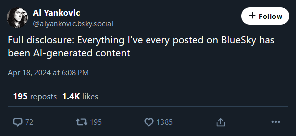
Al-generated content. You read that wrong.
(lemmy.world)
A place to share screenshots of Microblog posts, whether from Mastodon, tumblr, ~~Twitter~~ X, KBin, Threads or elsewhere.
Created as an evolution of White People Twitter and other tweet-capture subreddits.
Rules:
Related communities:
Or : a lesson in typography, and why lower-case L ought to have a serif or curve.
Fʀᴀɴᴋʟʏ, I'ᴍ ɴᴏᴛ ᴇᴠᴇɴ ᴄᴏɴᴠɪɴᴄᴇᴅ ᴡᴇ ɴᴇᴇᴅ ʟᴏᴡᴇʀᴄᴀsᴇ ʟᴇᴛᴛᴇʀs ɪɴ ᴛʜᴇ ғɪʀsᴛ ᴘʟᴀᴄᴇ. Sᴇᴇᴍs ᴛᴏ ᴍᴇ ᴛʜᴀᴛ's ᴊᴜsᴛ ᴀsᴋɪɴɢ ғᴏʀ ᴛʀᴏᴜʙʟᴇ.
I read this in the voice of Death from Discworld. I didn't even realize I had an internal voice actor assigned to him.
Christopher Lee
After reading this comment, I too read the comment it was responding to in the voice of Discworld's Death. Something both warm and somewhat metallic.
Minuscule letters were invented to write on paper and similar materials, because curved strokes had lower probability of tearing the material (as opposed to majuscule letters' angular features, adapted to carving in stone or similar materials). Now that we're not restricted by materials, might as well only use one case
Is that well documented? I thought it was just because it makes writing more fluid, and people tend to evolve towards fluid movements when they repeat the same ones all the time as it requires less energy. Ex: high-level musicians or sport practicionners.
They tried documenting it, but the material kept tearing
I've heard that that's the reason alphabets from languages in the South East Asia (like Thai or Khmer) is all about circles as to not tear the writing material back in the day - leaves.
I'm a big fan of Chinese seal script used for stone engravings just like the look
Make Writing (adapted for) Stone Again
They're also way faster to read though.
I did a deep dive on this recently (my day job is in architecture, and in the US we infamously MAKE ALL NOTES ON DRAWINGS IN ALL CAPS BECAUSE THAT'S THE WAY WE'VE DONE IT SINCE WE HAND LETTERED IN BLOCK PRINT SO THAT DIFFERENT DRAFTERS' SHEETS ALL LOOKED CONSISTENT) and it turns out that's 100% just an acclimation effect -- the old conventional wisdom of skilled readers recognizing lower-case word shapes doesn't hold water. If tomorrow we deleted lower-case letters from every Latin font on earth, given time we'd be able to read all-caps text just as fast as we currently read sentence case.
Which was disappointing for me to find out, since I REALLY HATE SHOUTING AT CONTRACTORS THROUGH THE PAGE ALL THE TIME and wish I could make a convincing case for sentence case, but oh well.
That's good to know. And in the premise of this thread it's relevant. However, since we're used to sentence case now, it still makes sense to keep it that way unless there's a compelling reason to switch.
On the other hand, street signs in Sweden, where I come from, are uppercase. I was completely used to that despite reading mostly sentence case in any other situation. However, since I moved to Denmark, where street signs are sentence case, I now feel like it takes slightly longer to parse signs when I go to Sweden. I guess if I'm correct, that's a case for quick acclimatation, as this happened over only a few years.
Can I ask what your night job is?
Toddler dad, mostly.
Come to think of it, is there actually much of any point to capital vs lowercase letters? You know what the first word of a sentence is anyway because of the period before, and names can be identified by context. Why do we even have capitalization in the first place?
It's a plot by Big Typesetting to sell more letters. Wake up sheeple!
https://xkcd.com/1013
As I mentioned in another comment, the original reason we have majuscule and minuscule letters is the difference in materials they were written on. Having them persist in the typesetting is in fact more of a historical artifact
We need capitals, as otherwise shouting online would have to move to bold
Could always use italics, or excessive exclamation marks!!! Or * shouts at u * cringey online roleplay syntax.
Sure but that all takes extra keystrokes. Caps lock is cruise control for shouting
Also the *shouts at you* tag was classic in chat things, but places like this need escapes to make them look right
Hmm. Still harder to read and comes across as yelling, even when the capital letters are itty-bitty...
𐑯𐑴𐑐. 𐑿 𐑒𐑨𐑯 𐑛𐑵 𐑢𐑦𐑞𐑬𐑑 𐑤𐑴𐑼𐑒𐑱𐑕 𐑓 𐑖𐑫𐑼.