
Software used to have personality.
The Memiverse:
!90s_memes@quokk.au
!philosophymemes@quokk.au
!sigh_fi@quokk.au
Software used to have personality.
Whatever happened to skins in general, not even just Winamp?
Well, a lot of them have turned into microtransaction purchasables depending on the app/game.
CEF and Electron happened. Or, more precisely, web developers decided they are app developers now.
They didn’t want to miss out on selling apps for a few bucks. Something that’s basically impossible to do with websites.
But, but, your custom skins destroy our carefully on-brand design!
Outside of iPhones you can skin all sorts of stuff in Android
Not just skins. Themes in general. Windows 95, 98 and XP had MS Plus! where people could install themes like this and modify Windows to their taste. And now Microsoft won't let you switch to dark mode if you don't have Windows activated.
Customization was one of the biggest reason why I switched to Linux in the early 2000. I could apply a single GTK theme to most of my apps, in one click, while Microsoft was moving away from this. Oh the glorious days of having matching themes for XMMS and Gkrellm, with Compiz and wobbly windows. It's also why I stuck so much to GNOME 2 style of desktops and switched to MATE. I took my multiple years to give up on my favourite GTK2 theme.
But even on Linux now is either white, or boring dark gray. Still much easier to personalize though. I miss the days of ricing my desktop until it looked lit this.

Ugh, terrible. Not a single space for an advert.
They still had those back then. People just collectively forget the shit we had to put up with like AOL and some dial-up ISPs that provided free Internet on condition that every page loaded with an ad banner iframe at the bottom of the browser.
What do I win? I don't actually use it like this though
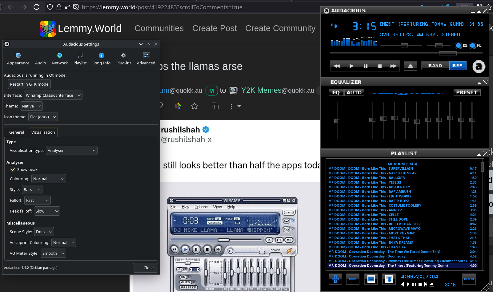
Audacious, one of the first programs I loved installing when I started with Linux back in 2009.
Devs seem tied down to the frameworks they use. Creativity shouldnt be restrained by the tools.
Middle management only wants Material Design 3, to show that we are on the cutting edge.
Lol. I asked my devs to add mouse event control (drag, wheel) to a viewer we found on the internet with full, functioning source (it was part of a tutorial). They disappeared, and it been a couple of weeks now... Smh.
The dev tools getting better over time has meant that it’s easier for us to make interfaces that can accommodate a lot of different screen sizes and zoom levels and accessibility stuff. But all those varieties of screen sizes means it’s very difficult to make those nice pixel-perfect interfaces and still work on most devices.
And that’s not even taking into consideration the project manager yelling “FASTER FASTER FASTER” all day. A lot of us would love to return to hand-crafted interface design and take our time to make nice things. But software moved out of the nerd space and just became another place for the MBA’s to colonize. Now it’s all KPI’s and standups and soulless flat minimum viable products that never get improved.
Hey, cool, this was my thought too. Things were just easier when everyone had 1024X768 or so.
Fair observation
A UI that doesn't leverage AI, has no ads, and loading it doesn't take 2GB of RAM??
What's even the point of it?
Productivity? Stay-out-of-your-way design approach?
Madness I say!
. . .
But also reject decades old modernities, return to classic way of life!
(This is from the time before PCs were common & you had to spank llamas via irl devices.)
I prefer the UI here to the one in the post several times over.
Same, I always switched to classic when I used Winamp.
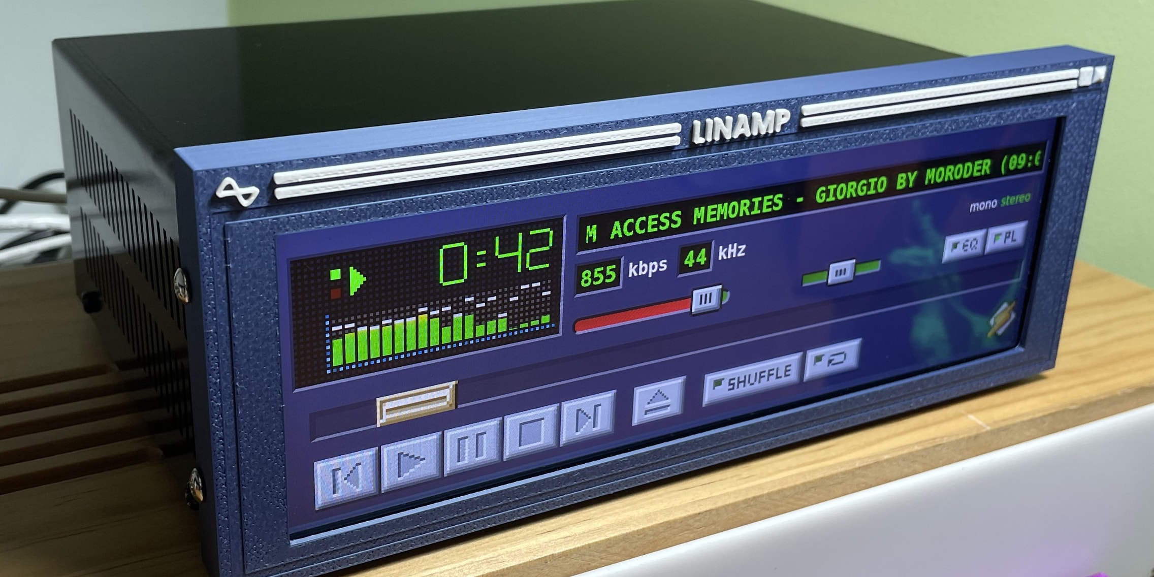
One day I well get through the dark web of dependencies needed for the visualization thing for my PiCorePlayer.
I still have all the photoshop and illustrator knowledge to make these a thing still, when the world is ready for them again. The bevels. The emboss. The gradients and drop shadows. I member it all. Theres a lot of inset emboss as well
Gothic/Baroque moment of Ul design
It's called Frutiger Aero you uncultured swine 😤😤
He's right though
Can't scale tho, we always thought it looked better even back then but resolutions went up and it looked stupid small so they fix it on the next version but then resolutions went up again so they had to fix it again, eventually they said fuck it and mathematicaly defined everything so it can scale to any screen any size or aspect ratio, it's better this way despite what we lost.
Nothing is stopping this from being scalable.
Rasterization, you probably could simulate the 3D effect in real time these days although it would be a waste of resources but back then not a chance, you would generate each UI element once and take a picture of it and use that as the UI.
Yeah I was referring to modern day, vector images are everywhere and easy to render. "Waste of resources" is a weird thing to mention because it's entirely subjective. All visuals could be called that compared to a TUI.
You could totally replicate that winamp interface with vector graphics. You'd only have to maintain the same aspect ratio
Are you saying we should build a 3D rendering engine into the start up file of every application that does nothing but change a few variables??? We could now but why would we? And back then not a chance.
Vector graphics are 2d and used in websites all the time. ~NO WAIT don't make an electron.. too late..
This is not Vector it has shading and translucent glass and glare it was made on a primitive 3D engine thinking you could do this with vector is exactly why you don't have UI like this anymore, you cannot.
Vector elements can also have shading and translucency without requiring a 3D engine. Easily. If the reflections don't move, there's no need to use 3D rendering for any of this.
Modern operating systems have hardware accelerated graphics for the GUI. This is nothing new. Apple started doing this with Mac OS X more than 20 years ago. Drop shadows and animations for windows and everything. Windows Vista was when Microsoft started doing it.
The rendering engines are already there and loaded.
Hardware acceleration is not a rendering engine it is simply using the video card for assets instead of the cpu, to generate this on the fly you would either have to create your own engine from scratch in the start up, use an open source 3D engine and imbed it into the start up or pay a company to use theirs, none of which are efficient, useful or stable and I remind you this is all for a slider that can be created from a simple api and look ~as good and even if you disagree the vast majority of people do not so their is still no reason to pour more development time into a UI that would be more time consuming, complex and expensive to create than the app itself.
All you need to do to make something scalable is to design it with vector art rather than bitmaps. Even with variable resolutions, you can still make something look nice.
No, the real kicker is that nearly every 'app' these days is secretly a webpage, complete with everything that entails, pro or con.
Very little wasted space, every element has a purpose whether it is interaction, information, or separation. Elements are easily distinguished from each other. The meaning of each item is largely clear. Nearly every commonly-needed function is readily accessible and easy to find.
A+. Better than just about any modern UI.
It really whips the llama's ass
WACUP is the romhack-like edit of Winamp that still works in 2026
Personally, I don't think this looks that good. It's just a copy of how the physical hardware looks. People who have only used digital options will say this has character, but the character is just copying what people were already used to. It's interesting now because most people don't remember the physical versions, so this looks unique. Back then, the versions we now have would look more unique. It's all about perspective.
They did have skins though, so it could look like anything. That's one thing that's missing from a lot of modern software. You can't customize it.
Aha I was just thinking that it's clearly inspired by the silver blue bubble design language Sony used to use.
I do note that it does feel like the flat material design language that still permeates a lot of digital design has been around for far longer than pre 2010 styles.
Only now after what feels like 15 years are gradients coming back. Still not really anything interesting.
Classic skin or gtfo.
Yeah. I remember it getting released and people hating it compared to the old one
Still use it when I must use Windows!
It's hideous
looks better than anything made by big tech in the last 10 years
Then download a different skin!