this post was submitted on 22 Apr 2025
472 points (97.6% liked)

Fuck AI

2537 readers
1601 users here now

"We did it, Patrick! We made a technological breakthrough!"

A place for all those who loathe AI to discuss things, post articles, and ridicule the AI hype. Proud supporter of working people. And proud booer of SXSW 2024.

founded 1 year ago
MODERATORS
 
(page 2) 50 comments
sorted by: hot top controversial new old
[–] Soleos@lemmy.world 17 points 5 days ago* (last edited 5 days ago) (3 children)

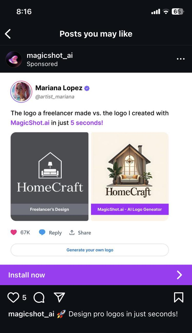
This is not an AI vs professional human issue, this is an issue with taste. You cannot prevent someone from pointing to the right option and saying "I want that to be my logo because it's a pretty illustration"

You can easily get ChatGPT to generate logos that are at least functional, give it a try. Start with

  1. What are the fundamental rules and standards of designing a logo?
  2. Based on these rules, generate a logo for the brand "HomeCraft" involving the shape of a house.

I'm not saying it comes close what a professional will give you, but it's a million times better than what your worst DIY client brings to the table.

[–] conditional_soup@lemm.ee 13 points 5 days ago (2 children)

That's fair. I think the biggest problem with AI logos is getting the AI to calm down. It can't help but to fill the slop bucket completely full; even if you tell it to keep things simple, it has an overwhelming urge to just keep pumping in more detail.

Imo, the left hand logo is better. Can you imagine trying to get the right side logo on a hat? Probably the best you could do for a reasonable price is a shitty screen print job that'll fall apart soon.

load more comments (2 replies)
[–] Arkthos@pawb.social 8 points 5 days ago* (last edited 5 days ago) (1 children)

I decided to see what would be made following your prompt. Here's the image.

Seems decent. Doesn't really have the warmth of a home, but that's more on the prompt specifying house without further detail. I took it a step further and told it to add a couch and a lamp like in the logo in the op.

I definitely prefer the freelancer one but I don't think it's bad. Certainly better than the logo in the op lmao.

Edit: given where I am I should probably specify I think it's not bad compared to the trash fire that is the ai logo in the op. Design wise it's very lazy and looks like someone threw in a pair of icons from an icon pack into a house in a generic way. The two assets in the house do not feel like they exist within the same space.

[–] Rai@lemmy.dbzer0.com 9 points 5 days ago (1 children)

The bottom one looks like there’s an old car in the house hahaha

load more comments (1 replies)
[–] nullpotential@lemmy.dbzer0.com 2 points 4 days ago (1 children)

You might be in the wrong community.

[–] Soleos@lemmy.world 2 points 3 days ago

I think the threats, limitations, and harms already underway due to AI are very real. And it's scary thinking how the issues will develop under the current ways such technologies get pursued and implemented to accrue power.

I also think we should be honest about the capabilities of the technology, the practical applications of it, and reconcile with the fact that the genie is out of the bottle. It's the industrial revolution, it's electricity, it's the assembly line, and nuclear fission.

[–] classic@fedia.io 12 points 5 days ago (5 children)

What is up with the weird soft look that so many AI images have?

[–] Catoblepas@lemmy.blahaj.zone 10 points 5 days ago (1 children)

It’s probably trained on a fuckton of Thomas Kinkade paintings, just statistically, since his output was so huge. He also had that kind of lighting going on, so it wouldn’t surprise me if that’s just baked into AI image generation now.

[–] classic@fedia.io 6 points 5 days ago (1 children)

Interesting. Never heard of him, but immediately recognized the style

[–] Catoblepas@lemmy.blahaj.zone 7 points 5 days ago

There’s a good couple of episodes from Behind the Bastards about him, if you’re into that sort of thing.

load more comments (4 replies)

I'mma be honest: I compared the two logos before reading anything, and absolutely loved the one on the left. It made me instantly want to learn more about the company. The one on the right just looks like a low effort depiction of the inside of a house, and I lost interest in what it was offering before I even got to the company name. I clicked in the post to put in my 2 pence, then read the whole image. Yeah... AI sucks.

[–] homesweethomeMrL@lemmy.world 9 points 5 days ago

Sometimes I think the AI bubble is about people who don't understand computers being put in a kind of purgatory where they have to work out why everything is wrong and bad.

[–] Fingolfinz@lemmy.world 9 points 5 days ago

Spoken like someone who has no clue about graphic design

[–] paperlibrarian@lemm.ee 8 points 5 days ago

The Dunning-Kruger tool.

Mariana Lopez should have at least said which freelancer she got the sample from. What an insult to their work.

load more comments
view more: ‹ prev next ›